Unified Brand Dashboards
Unifying experiences across brands through a scalable, system-driven dashboard

| Lead Designer | Web





T-Mobile
Metro
Magenta Prepaid
Assurance Wireless
What makes this project unique?
- Designed dashboards spanning four T-Mobile brands, each with distinct users, KPIs, and business constraints
- Advocated for UX validation / QA process on a team that doesn’t include it
- Balanced consistency and flexibility; sometimes context is more important than consistency
- I created libraries for consistent design due to our partial design system

Problem
Dashboard experiences across brands were fragmented and built as one-off pages. They were lacking a scalable system of components and patterns, which made it difficult to maintain consistency, support new use cases, and extend dashboards across both web and app experiences I contributed to.
The absence of a unified, component-driven approach created inefficiencies for teams and a disjointed experience for users.
Solution
Developed a modular dashboard system that consolidates core metrics and visualizations across brands, utilizes brand-flexible modules, supports future scalability, and integrates the updated design system.
Outcomes
- Established consistent component-driven architecture used across web and app experiences
- Reduced cross-brand UI and interaction inconsistencies by ~15% by defining standards adopted across design and engineering teams
- Improved product scalability that enabled faster rollout of new features and reduced design & dev rework
- Increased design velocity across teams by introducing a structured, consistent system that made it easier for other designers to build and adapt new dashboard experiences for evolving requirements
Learnings
- Balancing consistency with brand-specific nuance
- Priorities and trade-offs need revisiting or nonsense is grandfathered in
- Early design system thinking prevents redundancy
- I enjoy creating design systems and toolkits

Discover
What I did
- Conducted dashboard audits across all brands
- Interviewed stakeholders, surveyed customers, and moderated user tests
- Mapped user journeys and cross-brand interactions
- Ran competitive research and benchmarked scalable dashboard patterns
Key insights
- Inconsistencies caused user confusion and inefficiency
- Certain components were repeated but implemented inconsistently
- Users need both high-level overview and brand-specific drill-downs
- Opportunity to create a unified system that respects brand identity
Define
Scope & Experience Strategy
- Negotiated priorities across brand managers and product while advocating for the customer
- Aligned on core metrics, visualization standards, and component hierarchy
- Expanded scope beyond dashboards to include device details and plan details across brands
- Defined end-to-end flows for prepaid brands, independently driving UX strategy in lower-complexity surfaces
Key decision
Build a modular, brand-flexible design system that accommodate contextual differences with established variants.
Design
Approach
I iterated on layouts, hierarchies, and interactions across brands and tested for flexibility, scalability, and accessibility compliance.
Key decisions
- Component-first modularity to enable reuse across brands
- Consistent hierarchy and navigation to reduce cognitive load for multi-brand users
- Flexible drill-downs for both overview and detailed analytics
Deliver
What I delivered
- Multi-brand systems require structured thinking, negotiation, and advocacy
- Early design system integration prevents future inconsistencies and technical debt
- Clear documentation is critical for cross-functional adoption and scalability
Final refinements
- Polished modular templates, interaction guidelines, and accessibility patterns
- Documented component usage rules per brand
- Prepared handoff documentation for developers and design system team


Unified Brand Dashboards
Unifying experiences across brands through a scalable, system-driven dashboard
| Lead Designer | Web | Cross-functional, scalable, multi-brand




T-Mobile
Metro
Magenta Prepaid
Assurance Wireless
Summary
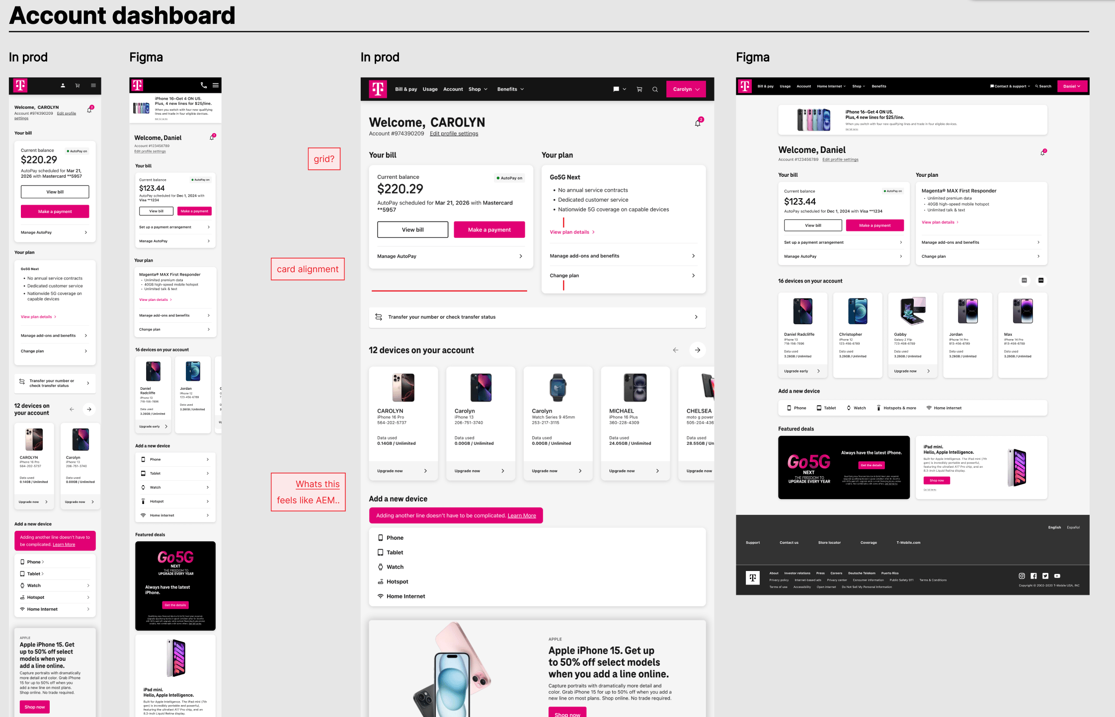
During a ticket to update the Metro by T-Mobile dashboard, I noticed some larger inconsistencies between brands.
What was live didn’t match what was in Figma, and what was in Figma didn’t match related Figmas.I brought this to the attention of the respective product owner and talked to engineers about the QA process that had been done, what we can do, and what would be best for both customers and expanding account flows moving forward.
My role
- Designed scalable systems for dashboards, considering the distinct customer needs, KPIs, and business constraints between brands
- Created & organized libraries for consistent design; delegated to & maintained alignment with working teams
- Balanced consistency and flexibility; sometimes context is more important than consistency
Problem
Dashboard experiences across brands were fragmented and built as one-off pages. They were lacking a scalable system of components and patterns, which made it difficult to maintain consistency, support new use cases, and extend dashboards across both web and app experiences I contributed to.
The absence of a unified, component-driven approach created inefficiencies for teams and a disjointed experience for users.
Solution
Developed a modular dashboard system that consolidates core metrics and visualizations across brands, utilizes brand-flexible modules, supports future scalability, and integrates the updated design system.
Outcomes
- Established consistent component-driven architecture used across web and app experiences
- Reduced cross-brand UI and interaction inconsistencies by ~15% by defining standards adopted across design and engineering teams
- Improved product scalability that enabled faster rollout of new features and reduced design & dev rework
- Increased design velocity across teams by introducing a structured, consistent system that made it easier for other designers to build and adapt new dashboard experiences for evolving requirements
Learnings
- Balancing consistency with brand-specific nuance
- Priorities and trade-offs need revisiting or nonsense is grandfathered in
- Early design system thinking prevents redundancy
- I enjoy creating design systems and toolkits
Discover
What I did
- Conducted dashboard audits across all brands
- Interviewed stakeholders, surveyed customers, and moderated user tests
- Mapped user journeys and cross-brand interactions
- Ran competitive research and benchmarked scalable dashboard patterns
Key insights
- Inconsistencies caused user confusion and inefficiency
- Certain components were repeated but implemented inconsistently
- Users need both high-level overview and brand-specific drill-downs
- Opportunity to create a unified system that respects brand identity
Discover
Scope & Experience Strategy
- Negotiated priorities across brand managers and product while advocating for the customer
- Aligned on core metrics, visualization standards, and component hierarchy
- Expanded scope beyond dashboards to include device details and plan details across brands
- Defined end-to-end flows for prepaid brands, independently driving UX strategy in lower-complexity surfaces
Key decision
Build a modular, brand-flexible design system that accommodate contextual differences with established variants.
Design
Approach
I iterated on layouts, hierarchies, and interactions across brands and tested for flexibility, scalability, and accessibility compliance.
Key decisions
- Component-first modularity to enable reuse across brands
- Consistent hierarchy and navigation to reduce cognitive load for multi-brand users
- Flexible drill-downs for both overview and detailed analytics
Deliver
What I delivered
- Multi-brand systems require structured thinking, negotiation, and advocacy
- Early design system integration prevents future inconsistencies and technical debt
- Clear documentation is critical for cross-functional adoption and scalability
Final refinements
- Polished modular templates, interaction guidelines, and accessibility patterns
- Documented component usage rules per brand
- Prepared handoff documentation for developers and design system team

Unified Brand Dashboards
Unifying experiences across brands through a scalable, system-driven dashboard
| Lead Designer | Web | Cross-functional, scalable, multi-brand
Summary
During a ticket to update the Metro by T-Mobile dashboard, I noticed some larger inconsistencies between brands.
What was live didn’t match what was in Figma, and what was in Figma didn’t match related Figmas.I brought this to the attention of the respective product owner and talked to engineers about the QA process that had been done, what we can do, and what would be best for both customers and expanding account flows moving forward.
My role
- Designed scalable systems for dashboards, considering the distinct customer needs, KPIs, and business constraints between brands
- Created & organized libraries for consistent design; delegated to & maintained alignment with working teams
- Balanced consistency and flexibility; sometimes context is more important than consistency
Problem
Dashboard experiences across brands were fragmented and built as one-off pages. They were lacking a scalable system of components and patterns, which made it difficult to maintain consistency, support new use cases, and extend dashboards across both web and app experiences I contributed to.
The absence of a unified, component-driven approach created inefficiencies for teams and a disjointed experience for users.
Solution
Developed a modular dashboard system that consolidates core metrics and visualizations across brands, utilizes brand-flexible modules, supports future scalability, and integrates the updated design system.
Outcomes
- Established consistent component-driven architecture used across web and app experiences
- Reduced cross-brand UI and interaction inconsistencies by ~15% by defining standards adopted across design and engineering teams
- Improved product scalability that enabled faster rollout of new features and reduced design & dev rework
- Increased design velocity across teams by introducing a structured, consistent system that made it easier for other designers to build and adapt new dashboard experiences for evolving requirements
Learnings
- Balancing consistency with brand-specific nuance
- Priorities and trade-offs need revisiting or nonsense is grandfathered in
- Early design system thinking prevents redundancy
- I enjoy creating design systems and toolkits
Discover
What I did
- Dashboard audits across all brands
- Interviewed stakeholders, surveyed customers, and moderated user tests
- Mapped user journeys and cross-brand interactions
- Ran competitive research and benchmarked scalable dashboard patterns
Key insights
- Inconsistencies caused user confusion and inefficiency
- Certain components were repeated but implemented inconsistently
- Users need both high-level overview and brand-specific drill-downs
- Opportunity to create a unified system that respects brand identity
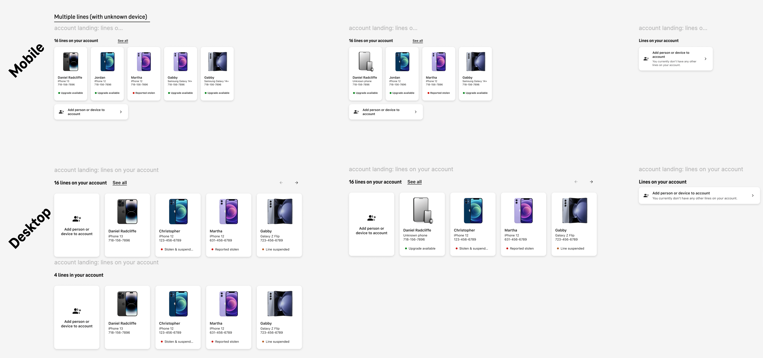
Card components
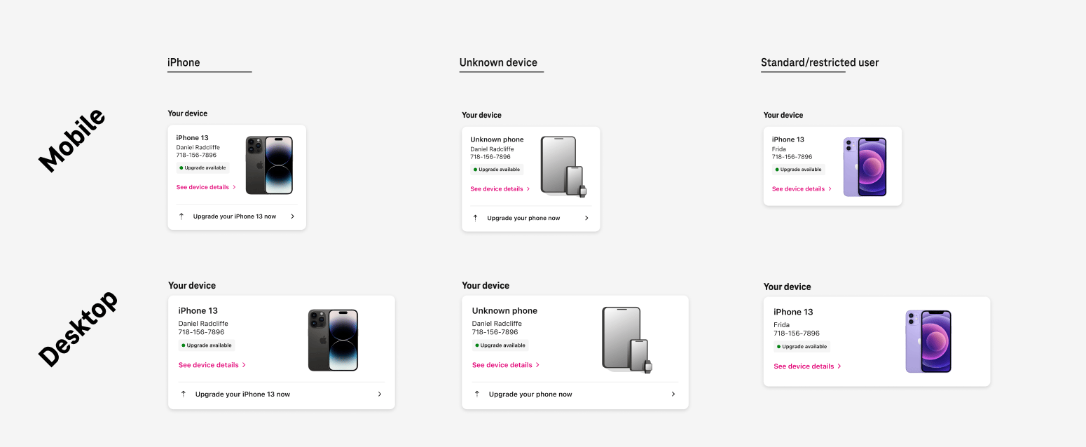
Device cards
Define
Scope & Experience Strategy
- Negotiated priorities across brand managers and product while advocating for the customer
- Aligned on core metrics, visualization standards, and component hierarchy
- Expanded scope beyond dashboards to include device details and plan details across brands
- Defined end-to-end flows for prepaid brands, independently driving UX strategy in lower-complexity surfaces
Key decision
Build a modular, brand-flexible design system that accommodate contextual differences with established variants.
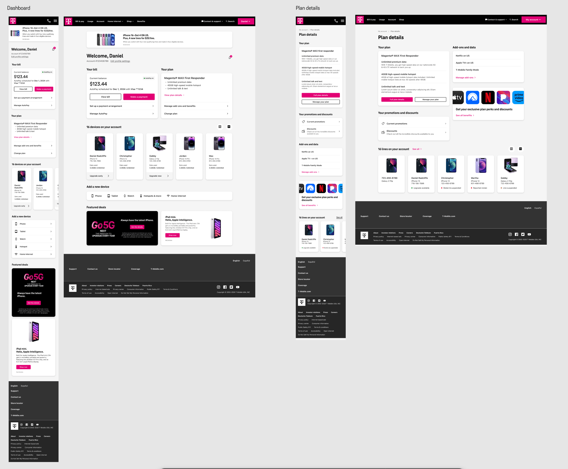
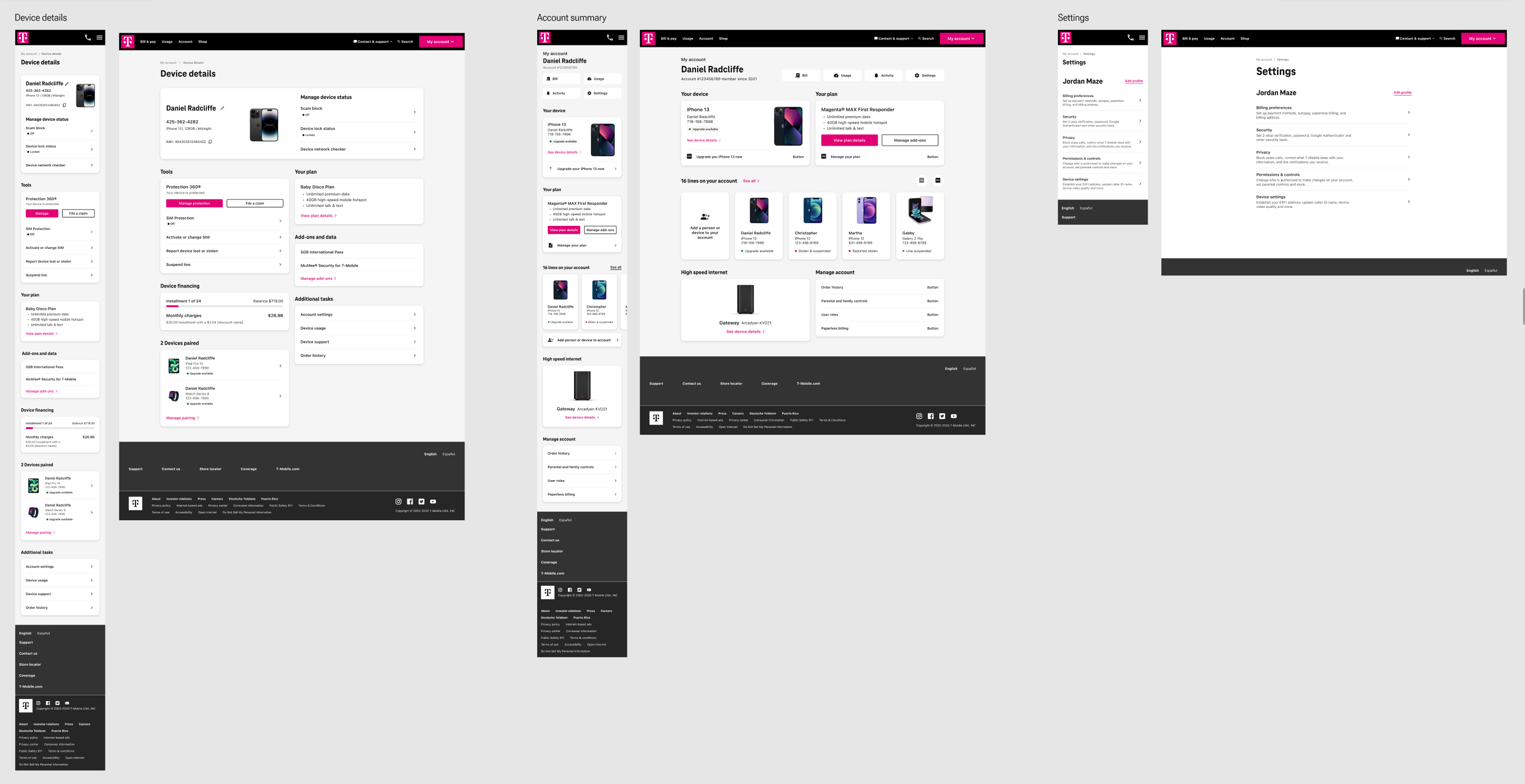
T-Mobile account pages
Design
Approach
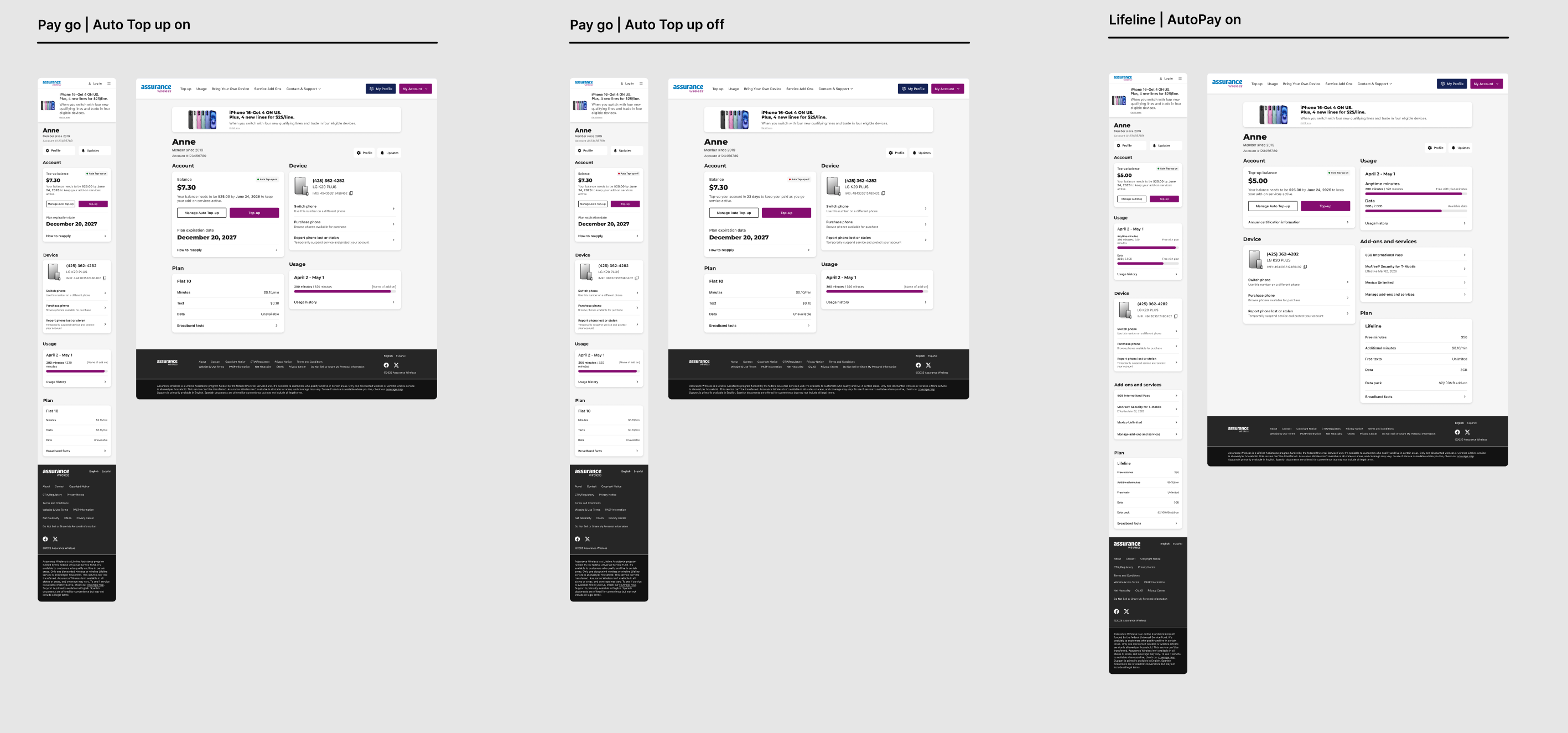
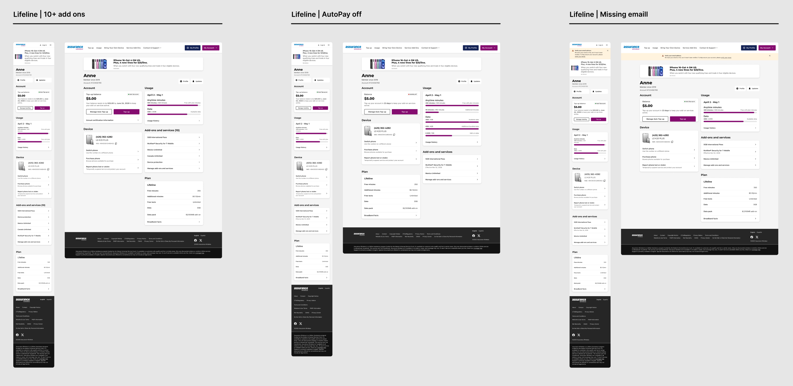
I iterated on layouts, hierarchies, and interactions across brands and tested for flexibility, scalability, and accessibility compliance.
Assurance Wireless account pages
Key decisions
- Component-first modularity to enable reuse across brands
- Consistent hierarchy and navigation to reduce cognitive load for multi-brand users
- Flexible drill-downs for both overview and detailed analytics
Deliver
What I delivered
- Multi-brand systems require structured thinking, negotiation, and advocacy
- Early design system integration prevents future inconsistencies and technical debt
- Clear documentation is critical for cross-functional adoption and scalability
Final refinements
- Polished modular templates, interaction guidelines, and accessibility patterns
- Documented component usage rules per brand
- Prepared handoff documentation for developers and design system team
Design QA | T-Mobile account pages