
Magenta Prepaid:
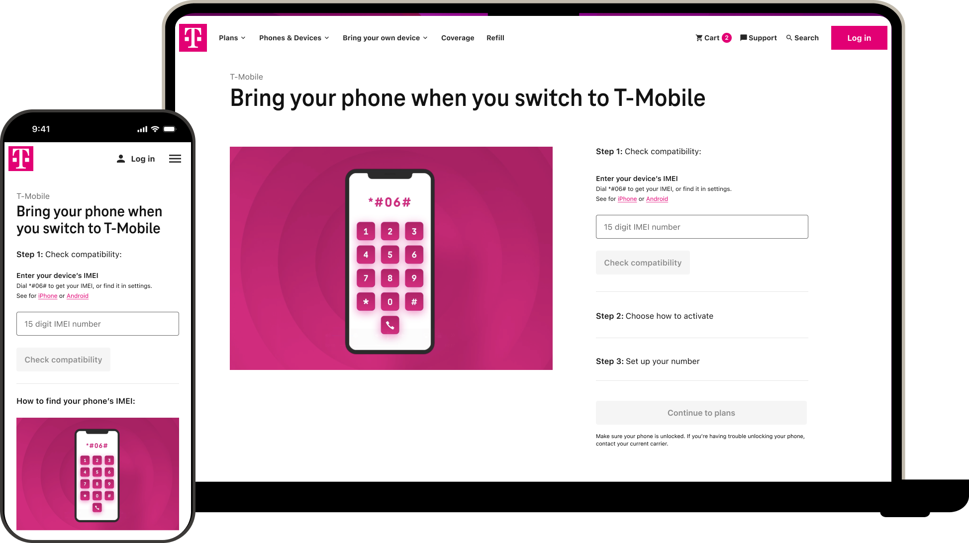
Bring Your Own Phone
Redesigning how customer’s switch to Prepaid T-Mobile without giving up their own phones

| Lead Designer | E-commerce | Web
Summary
Magenta Prepaid offer the perks of the T-Mobile network & brand family, without the credit checks. Customers tend to be temporary visitors to the country who pick up a plan and need to use their own phone.
This initiative sought to update the current experience as it was broken, resulting in a high number of calls to care.
This project would be the first Prepaid flow migrated to the new Design System.
Key challenges
- Establishing new UI patterns for Prepaid flows to follow moving forward
- Scope creep & multiple stakeholder misaligned on direction
My role
- Led design & delegated
- Negotiated stakeholder tradeoffs
- Worked with engineers to streamline components in new design system

Problem
Customers → Unclear how to complete disjointed screens to apply a new plan to their existing phone
Product → High calls to care because customers cannot complete task digitally; missing out on new accounts
Engineering → 1st flow using Phoenix (the new Design System)
UX → Current site had no data tagging for analysis; leadership has a “lift & shift” expectation from the T-Mobile postpaid designs
Solution
Create a cohesive e-commerce experience while establishing the scalable design and measurement foundations needed to support future growth

Discover
What I did
- Gathered and sorted through current flow and disjointed experience
- Delegated competitor analysis; connected designer to postpaid flows and designers to understand their process and what could be improved upon
- Delegated to & workshopped design exploration with another designer on the team
- Prepared user research questions & oversaw prototype creation for A/B testing
- Sought out if there was any data we could deduce behavior from
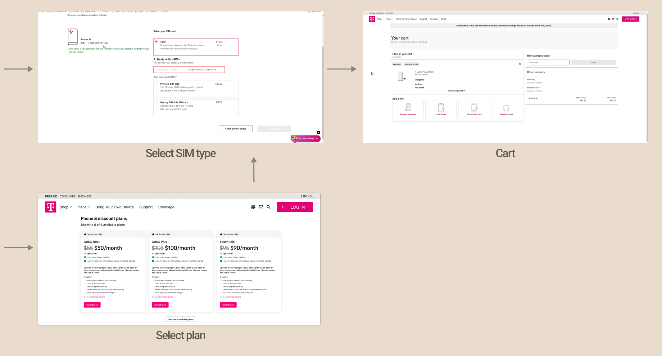
Before | User flow

Before | Screens

Analytics
10k
account sign ups
2.9k
pSIM purchases
4k
Device purchases
40%
Cart abandonment
Define
Stakeholder alignment
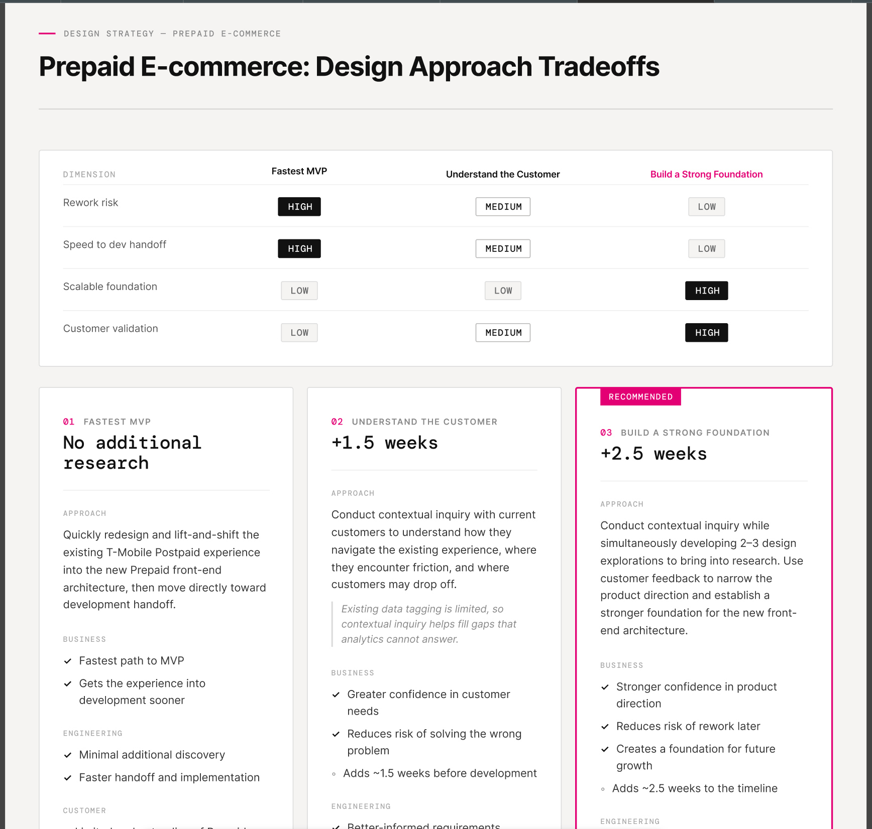
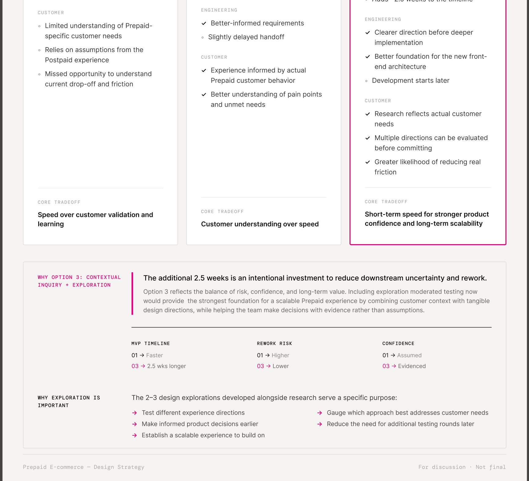
To ensure product & engineering was on the same page as UX, I created this trade off document.
UX recommendation:
Conduct full moderated sessions with customers to understand how they have experienced the current flow and test our iterative prototypes to get feedback on design direction.
Trade-off document
Design
Explorations & research
We surveyed for customers who had brought their own phone to Magenta Prepaid before, conducted a contextual analysis of the existing design, and A/B tested single vs multi-page to validate design direction
We needed data to reinforce deviating from the multi-page approach the T-Mobile postpaid had implemented. This was necessary to break free from the “lift & shift” mentaity mentioned in ux challenges.
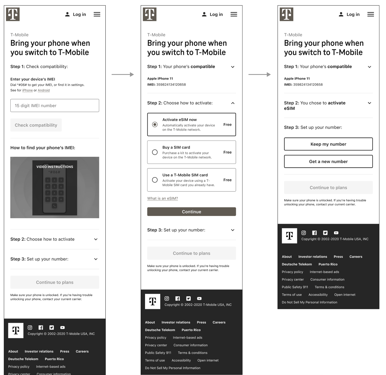
Single page approach
Multi-page approach
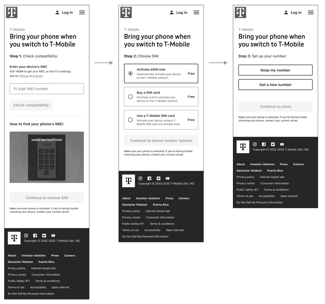
Research insights
We were able to pin point where customers quit the flow and what was causing the greatest friction.
Customers validated that the single page, accordion approach was preferred.
Where users quit the flow

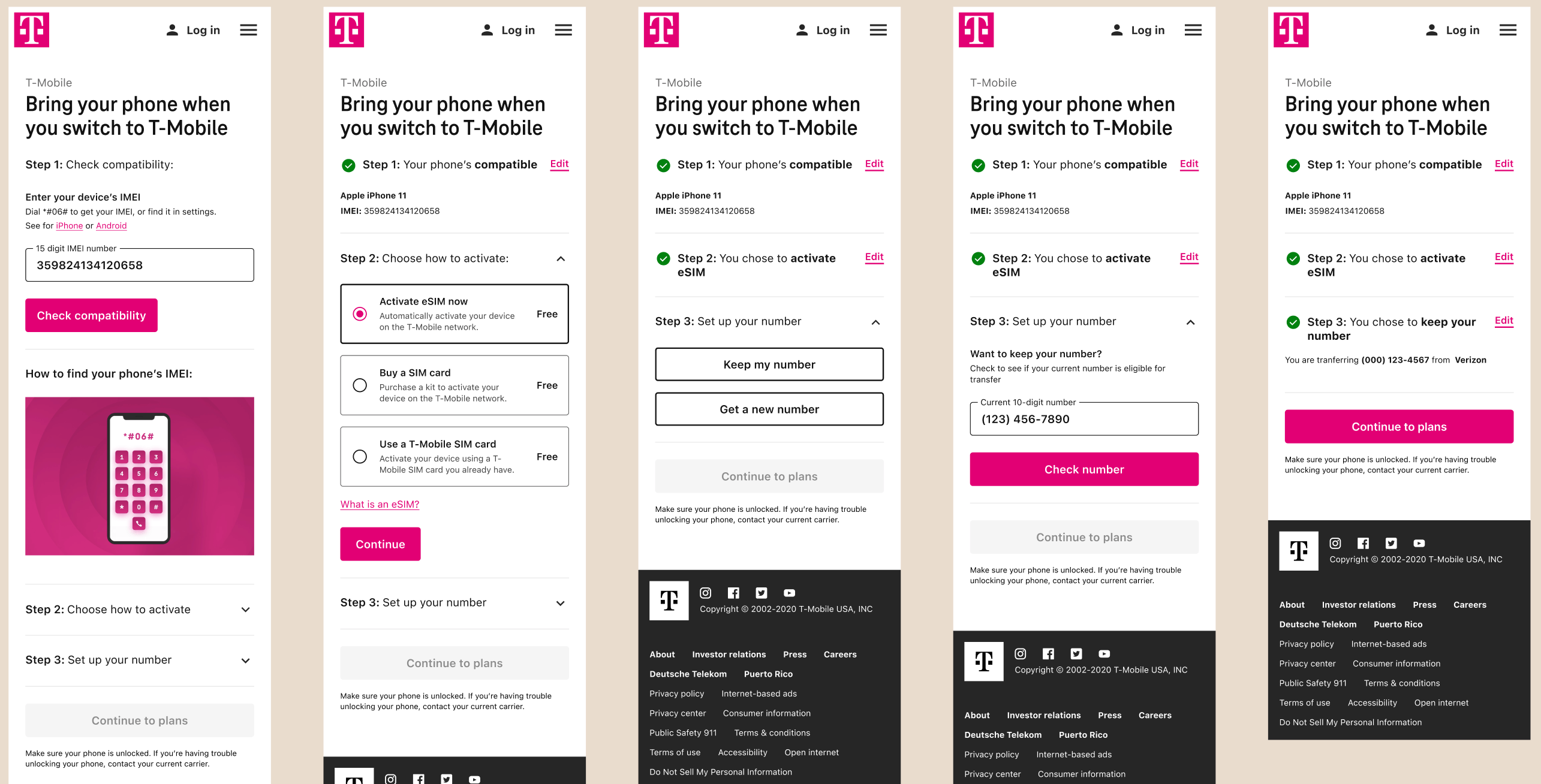
Final design
At this point in the project the other design off boarded and I took over final designs.
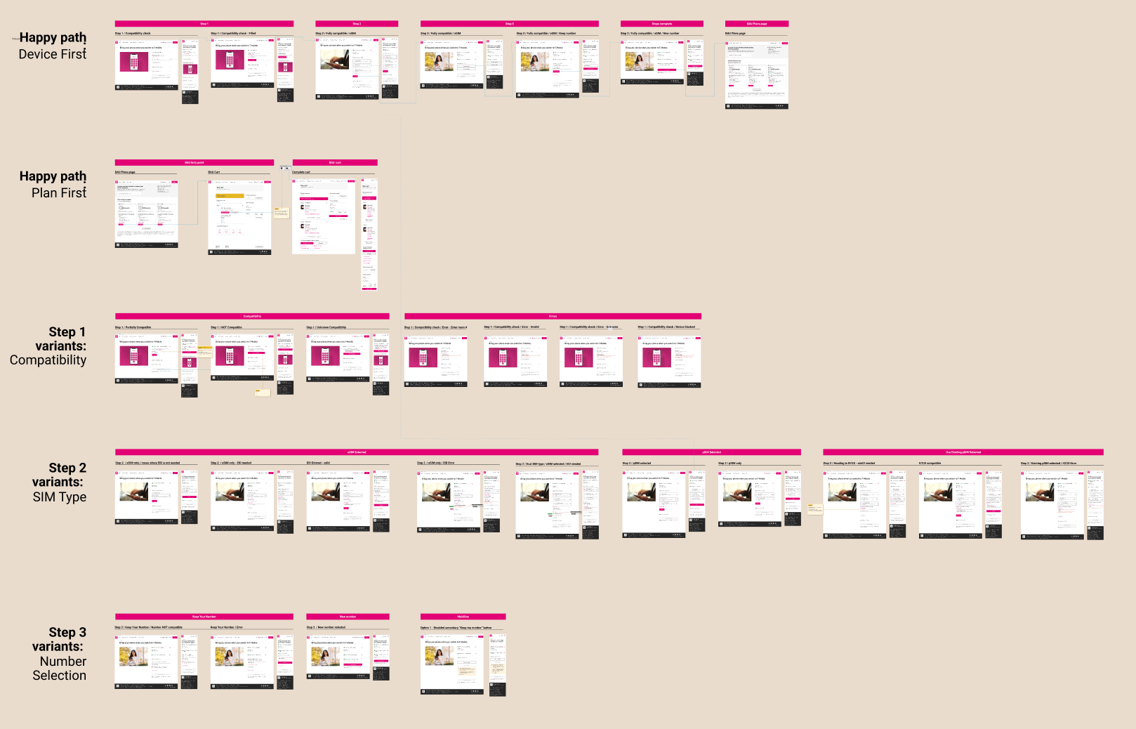
I went through stakeholder reviews & feedback to ensure we covered every state & scenario before hand off.
States & scenarios
Final design | Mobile happy path
Leadership review
VP of design approved and for the 1st time suggested postpaid needs to “lift & shift” and follows Prepaid’s lead.
Deliver
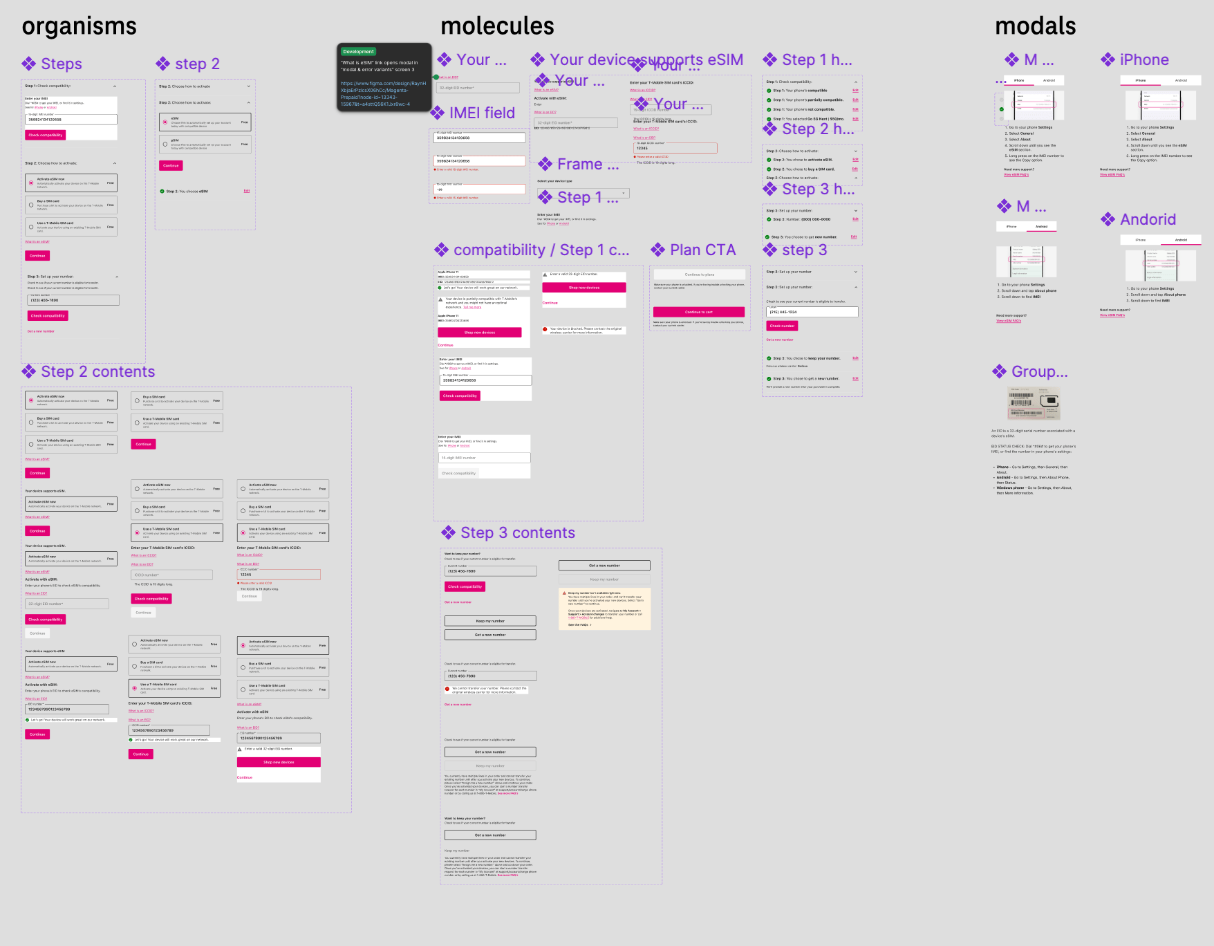
UI pattern scalability
- Phoenix provided shared patterns and standards across the new front-end architecture
- Using the system will create consistency and reduce one-off solutions
Components
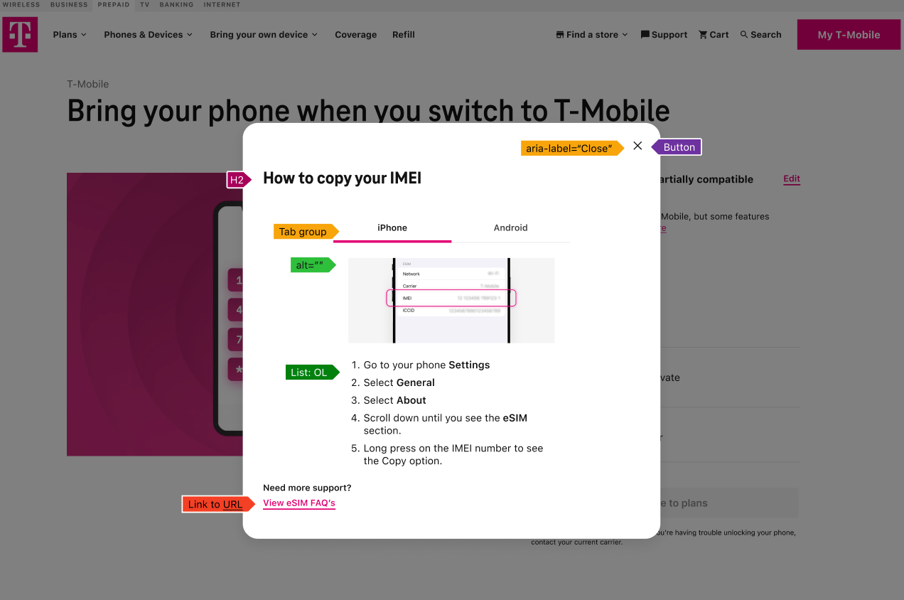
Accessibility
- Built to establish accessibility standards rather than adding fixes later
- Heading order, ARIA labels, video needs
- Ensured the experience worked for a broader range of customers
Multi-page approach
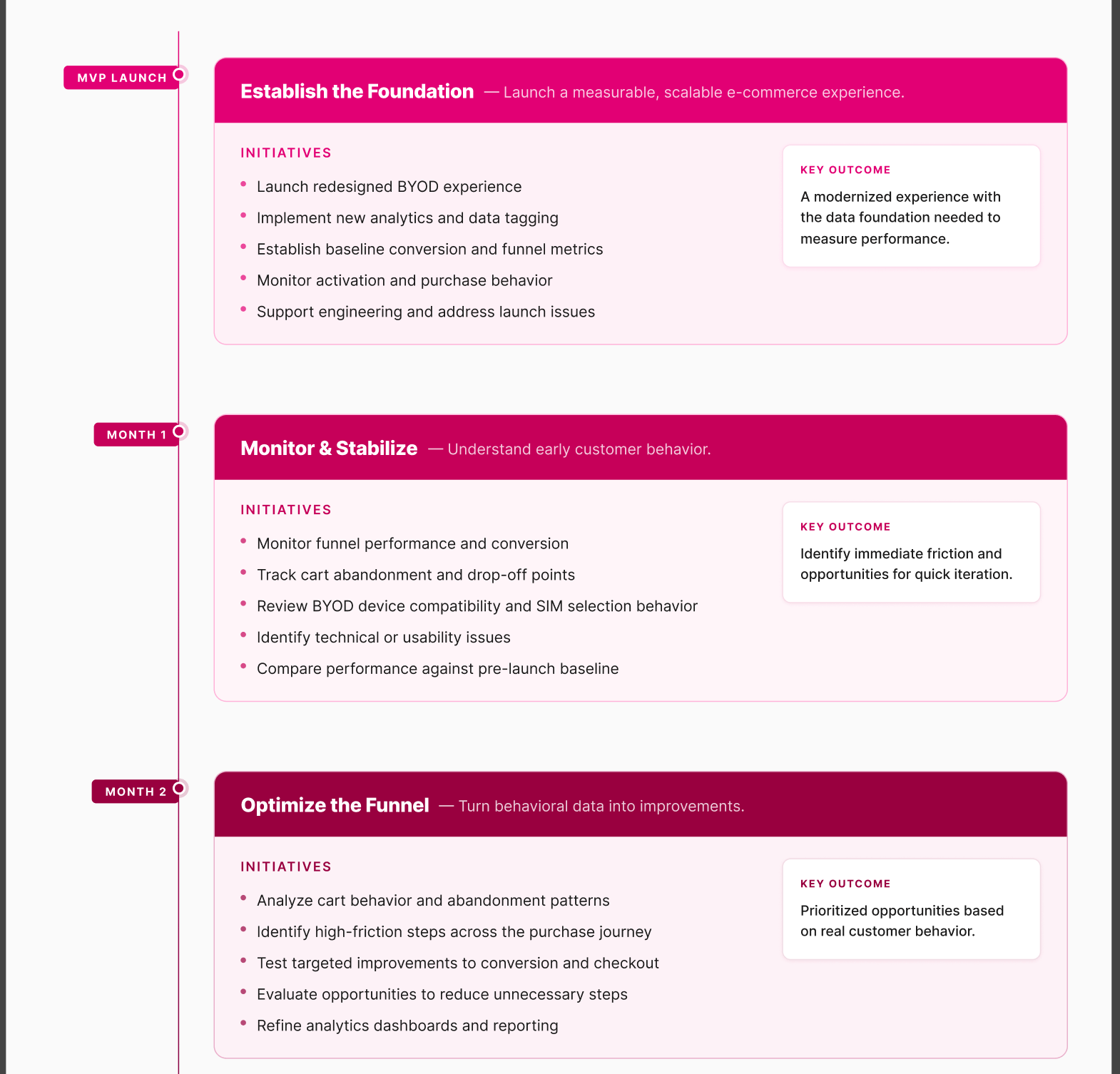
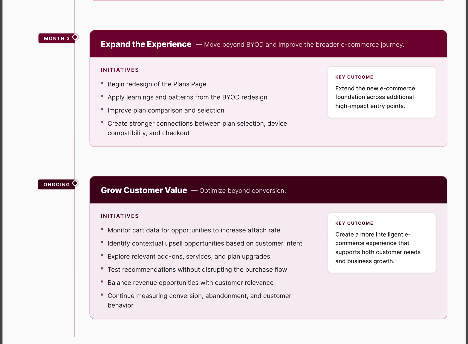
Roadmap


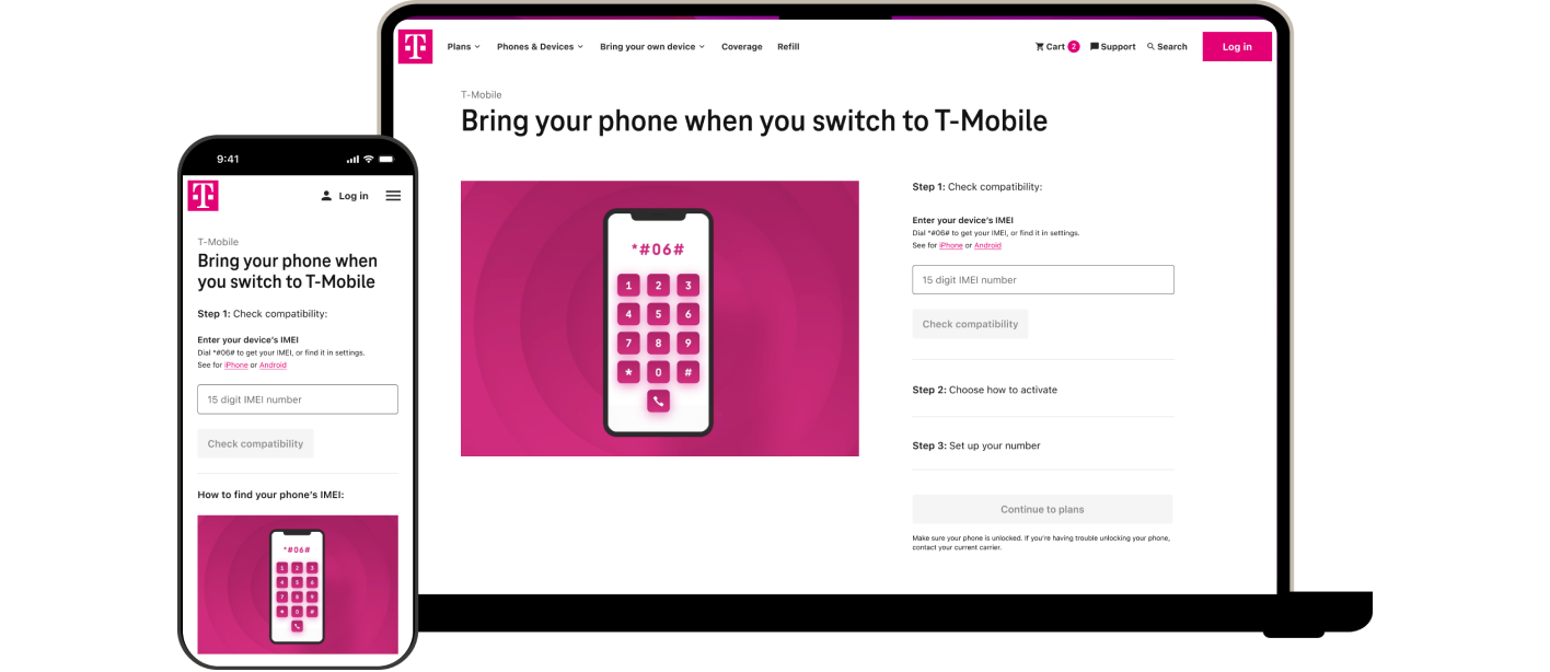
Magenta Prepaid:
Bring Your Own Phone
Redesigning how customer’s switch to Prepaid T-Mobile without giving up their own phones
| Lead Designer | E-commerce | Web
Summary
Magenta Prepaid offer the perks of the T-Mobile network & brand family, without the credit checks. Customers tend to be temporary visitors to the country who pick up a plan and need to use their own phone.
This initiative sought to update the current experience as it was broken, resulting in a high number of calls to care.
This project would be the first Prepaid flow migrated to the new Design System.
Key challenges
- Establishing new UI patterns for Prepaid flows to follow moving forward
- Scope creep & multiple stakeholder misaligned on direction
My role
- Led design & delegated
- Negotiated stakeholder tradeoffs
- Worked with engineers to streamline components in new design system
Problem
Customers → Unclear how to complete disjointed screens to apply a new plan to their existing phone
Product → High calls to care because customers cannot complete task digitally; missing out on new accounts
Engineering → 1st flow using Phoenix (the new Design System)
UX → Current site had no data tagging for analysis; leadership has a “lift & shift” expectation from the T-Mobile postpaid designs
Solution
Create a cohesive e-commerce experience while establishing the scalable design and measurement foundations needed to support future growth
Discover
What I did
- Gathered and sorted through current flow and disjointed experience
- Delegated competitor analysis; connected designer to postpaid flows and designers to understand their process and what could be improved upon
- Delegated to & workshopped design exploration with another designer on the team
- Prepared user research questions & oversaw prototype creation for A/B testing
- Sought out if there was any data we could deduce behavior from
Before | User flow
Before | Screens
Checkout
Analytics
10k
account sign ups
2.9k
pSIM purchases
4k
Device purchases
40%
Cart abandonment
Define
Stakeholder alignment
To ensure product & engineering was on the same page as UX, I created this trade off document.
UX recommendation:
Conduct full moderated sessions with customers to understand how they have experienced the current flow and test our iterative prototypes to get feedback on design direction.
Trade-off document
Design
Explorations & research
We surveyed for customers who had brought their own phone to Magenta Prepaid before, conducted a contextual analysis of the existing design, and A/B tested single vs multi-page to validate design direction
We needed data to reinforce deviating from the multi-page approach the T-Mobile postpaid had implemented. This was necessary to break free from the “lift & shift” mentaity mentioned in ux challenges.
Single page approach
Multi-page approach
Research insights
We were able to pin point where customers quit the flow and what was causing the greatest friction.
Customers validated that the single page, accordion approach was preferred.
Where users quit the flow
Final design
At this point in the project the other design off boarded and I took over final designs.
I went through stakeholder reviews & feedback to ensure we covered every state & scenario before hand off.
States & scenarios
Final design | Mobile happy path
Leadership review
VP of design approved and for the 1st time suggested postpaid needs to “lift & shift” and follows Prepaid’s lead.
Deliver
UI pattern scalability
- Phoenix provided shared patterns and standards across the new front-end architecture
- Using the system will create consistency and reduce one-off solutions
Components
Accessibility
- Built to establish accessibility standards rather than adding fixes later
- Heading order, ARIA labels, video needs
- Ensured the experience worked for a broader range of customers
Multi-page approach
Roadmap

Magenta Prepaid:
Bring Your Own Phone
Redesigning how customer’s switch to Prepaid T-Mobile without giving up their own phones
| Lead Designer | E-commerce | Web
Summary
Magenta Prepaid offer the perks of the T-Mobile network & brand family, without the credit checks. Customers tend to be temporary visitors to the country who pick up a plan and need to use their own phone.
This initiative sought to update the current experience as it was broken, resulting in a high number of calls to care.
This project would be the first Prepaid flow migrated to the new Design System.
Key challenges
- Establishing new UI patterns for Prepaid flows to follow moving forward
- Scope creep & multiple stakeholder misaligned on direction
My role
- Led design & delegated
- Negotiated stakeholder tradeoffs
- Worked with engineers to streamline components in new design system
Problem
Customers → Unclear how to complete disjointed screens to apply a new plan to their existing phone
Product → High calls to care because customers cannot complete task digitally; missing out on new accounts
Engineering → 1st flow using Phoenix (the new Design System)
UX → Current site had no data tagging for analysis; leadership has a “lift & shift” expectation from the T-Mobile postpaid designs
Solution
Create a cohesive e-commerce experience while establishing the scalable design and measurement foundations needed to support future growth
Discover
What I did
- Gathered and sorted through current flow and disjointed experience
- Delegated competitor analysis; connected designer to postpaid flows and designers to understand their process and what could be improved upon
- Delegated to & workshopped design exploration with another designer on the team
- Prepared user research questions & oversaw prototype creation for A/B testing
- Sought out if there was any data we could deduce behavior from
Before | User flow
Before | Screens
Checkout
Analytics
10k
account sign ups
2.9k
pSIM purchases
4k
Device purchases
40%
Cart abandonment
Define
Stakeholder alignment
To ensure product & engineering was on the same page as UX, I created this trade off document.
UX recommendation:
Conduct full moderated sessions with customers to understand how they have experienced the current flow and test our iterative prototypes to get feedback on design direction.
Trade-off document
Design
Explorations & research
We surveyed for customers who had brought their own phone to Magenta Prepaid before, conducted a contextual analysis of the existing design, and A/B tested single vs multi-page to validate design direction
We needed data to reinforce deviating from the multi-page approach the T-Mobile postpaid had implemented. This was necessary to break free from the “lift & shift” mentaity mentioned in ux challenges.
Single page approach
Multi page approach
Research insights
We were able to pin point where customers quit the flow and what was causing the greatest friction.
Customers validated that the single page, accordion approach was preferred.
Where users quit the flow
Final design
At this point in the project the other design off boarded and I took over final designs.
I went through stakeholder reviews & feedback to ensure we covered every state & scenario before hand off.
States & scenarios
Final design | Mobile happy path
Leadership review
VP of design approved and for the 1st time suggested postpaid needs to “lift & shift” and follows Prepaid’s lead.
Deliver
UI pattern scalability
- Phoenix provided shared patterns and standards across the new front-end architecture
- Using the system will create consistency and reduce one-off solutions
Components
Accessibility
- Built to establish accessibility standards rather than adding fixes later
- Heading order, ARIA labels, video needs
- Ensured the experience worked for a broader range of customers
Accessibility annotations
Roadmap