
CurranFloor
Elevating a luxury rug experience to simplify decisions and drive engagement
Lead Designer | Web | E-commerce, style guide, rug builder
What makes this project unique?
- Hired on to a 4 month contract, defined my own SOW, and earned a 4 month extension
- 17 employee company
- Redesigned CurranFloor’s digital experience & brand style guide
- Created the Rug Builder & Design Studio for fully customizable orders, informed by client conversations, user research, and stakeholder workshops. Defined a cohesive style guide to unify and scale the experience
Problem
- Too many paths to get users to the same place
- Clunky UI
- Need to call customer service to customize orders
- Ordering swatches functionality is hidden
- Cluttered Global Nav and Information Architecture
- No filtering or search functionality
Solution
- Restructure Information Architecture
- Create Rug Builder to enable digital customization
- Clarify entry points for swatches and promotions
- Create filter and search functionality through Design Studio and uniform Category Pages
- Create style guide
- Redesign homepage to lead customers
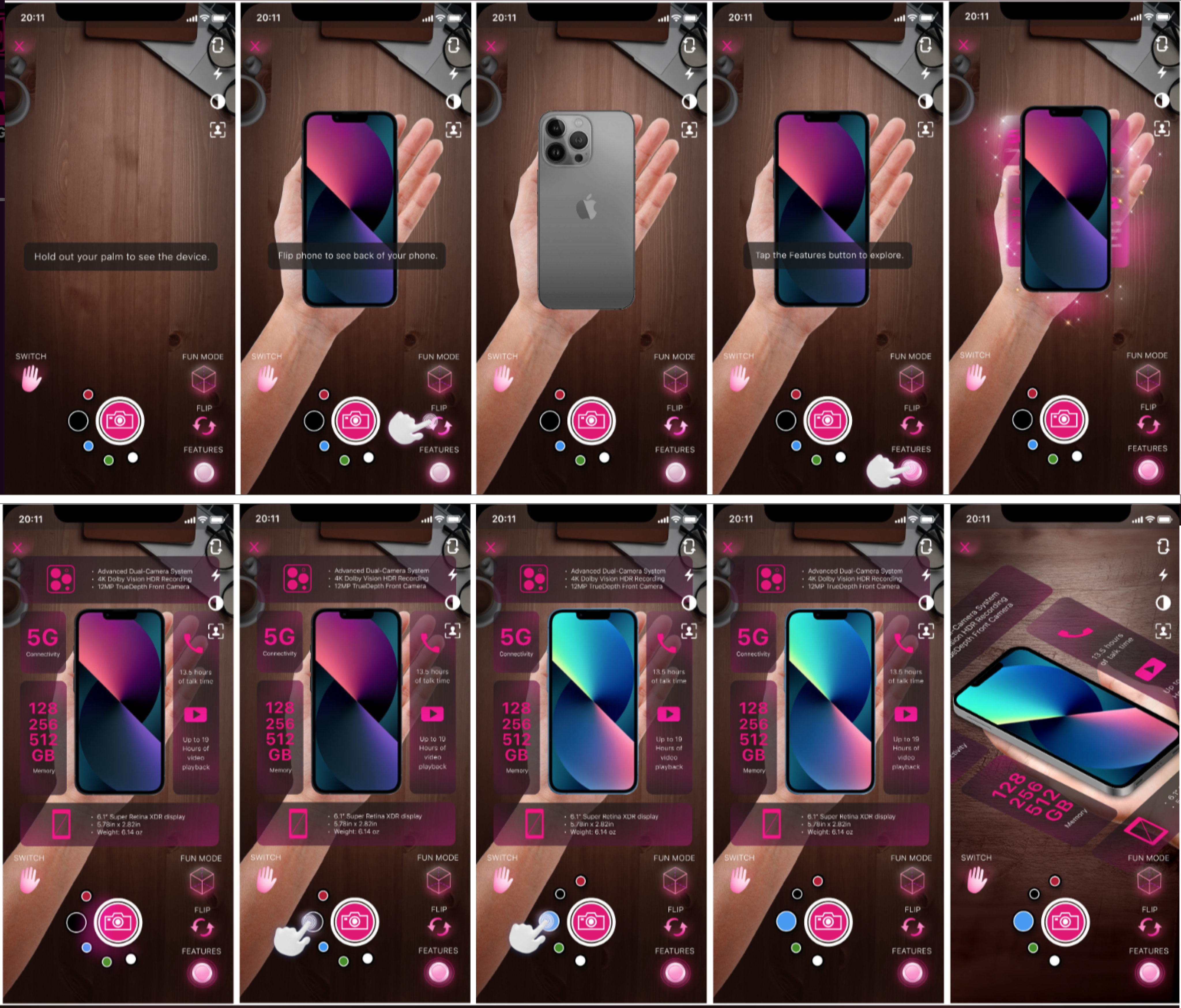
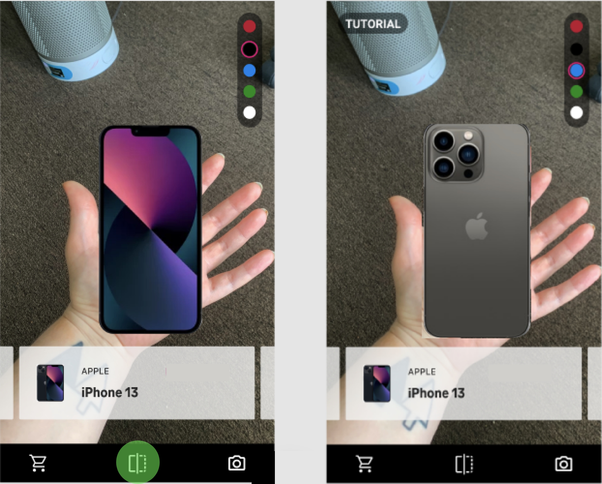
Explore selected phone with AR
Outcomes
- Defined an MVP “Browsing Experience” and a future-facing “Shopping Experience” roadmap
- Validated key features like hand-fit visualization, device interaction, and guided onboarding
- Established a cross-functional workflow for AR design + development collaboration
Learnings
- Strong ideas need ruthless prioritization to stay usable in emerging tech
- Designing for AR moves fast and needs daily collaboration with development
- How to navigate vendor collaboration and SOW constraints
- Adhoc usability testing in the office is a great way to get traction for your product
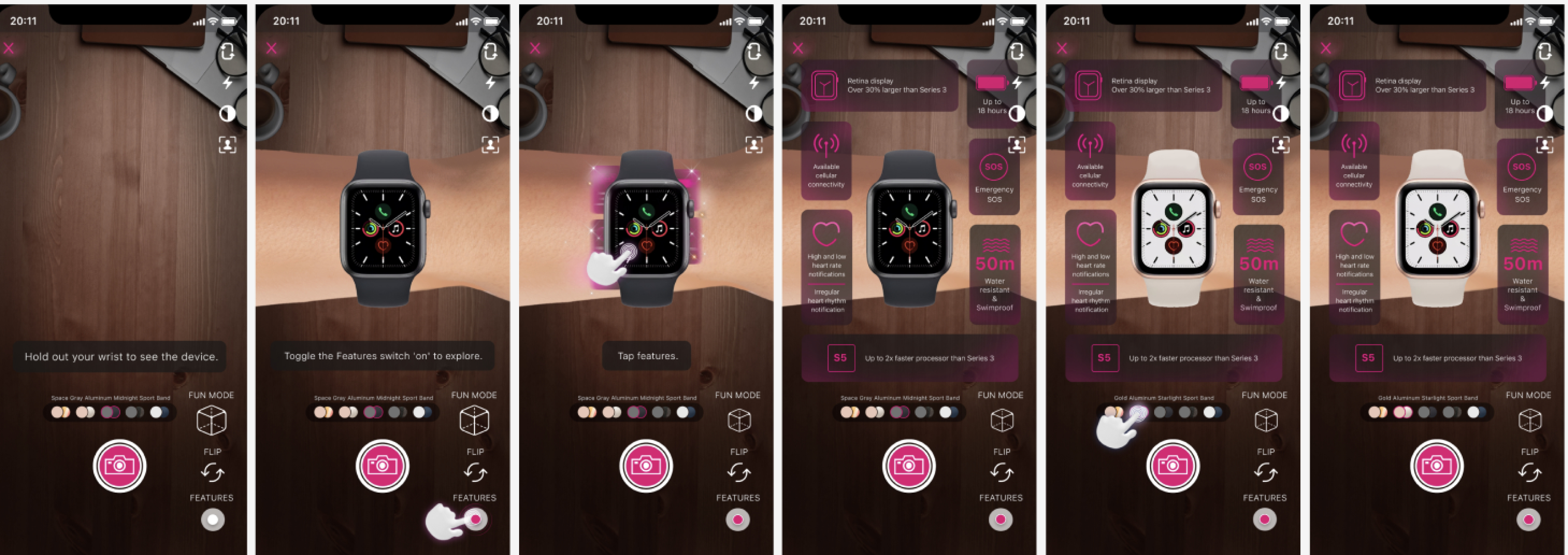
Explore selected watch with AR
Discover
What I did
- Synthesized prior research, interviews, and concepts into a centralized FigJam workspace
- Conducted additional user interviews to understand confidence gaps in online shopping
- Built personas and journey insights focused on hesitation and trust
- Performed competitive analysis across AR and e-commerce experiences (Ikea, Warby Parker...)
Key insights
- Users preferred online shopping but wanted to understand scale, feel, and interaction in a way that mimics in-store confidence.
- Users who preferred in-store purchasing were skeptical.
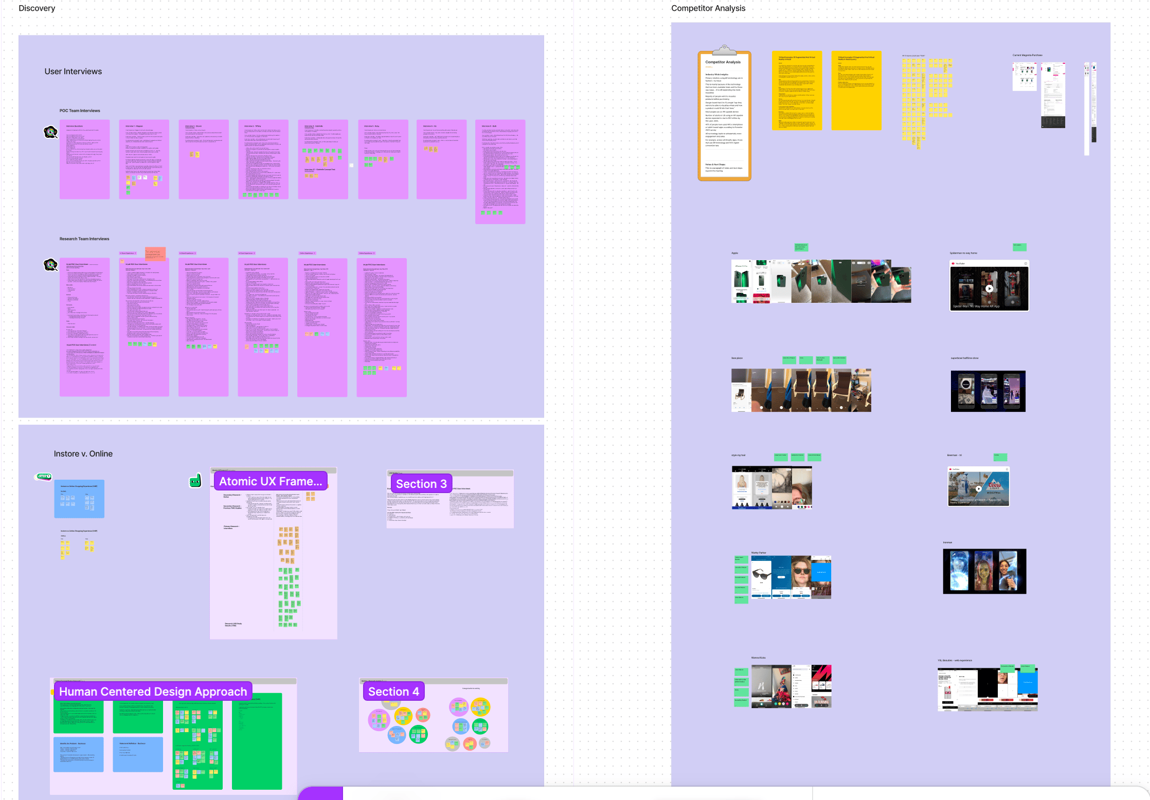
Interviews & competitors
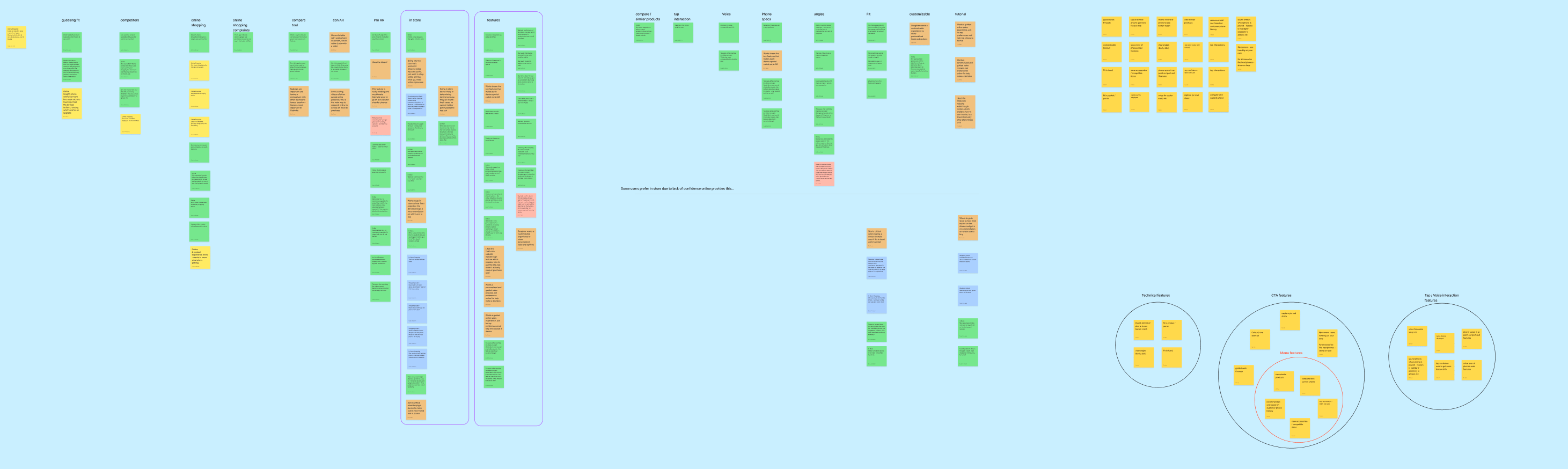
Affinity mapping interviews
Define
Stakeholder alignment
Led a design workshop with cross-functional partners
- Prioritized features using an impact vs. effort framework
- Aligned on iteration phases (MVP → future roadmap)
- Identified assumptions and defined “How might we” opportunities
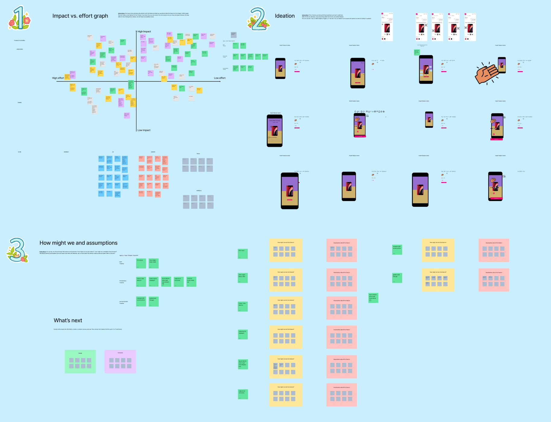
Stakeholder workshop
Feature prioritization
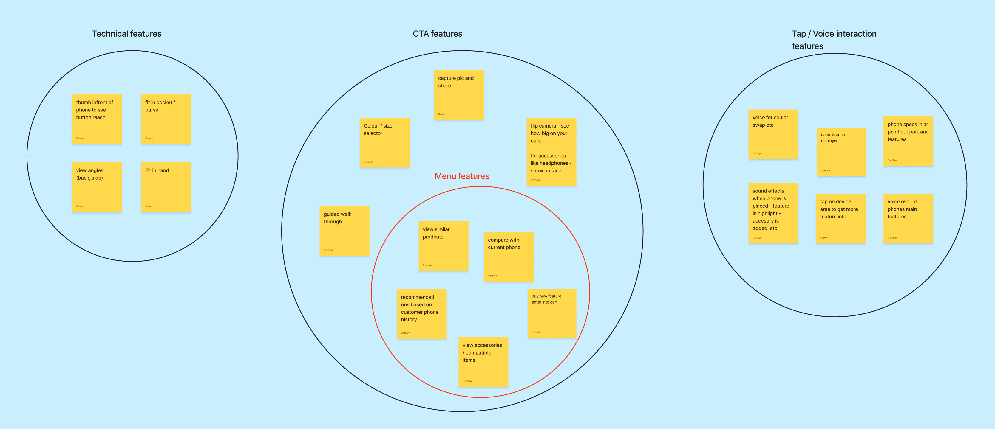
3 tiers of features
MVP (Browsing Experience)
- View phone in hand
- Flip device
- Basic onboarding
Iteration 2
- Color selection
- Feature highlights
- Snapshot & share
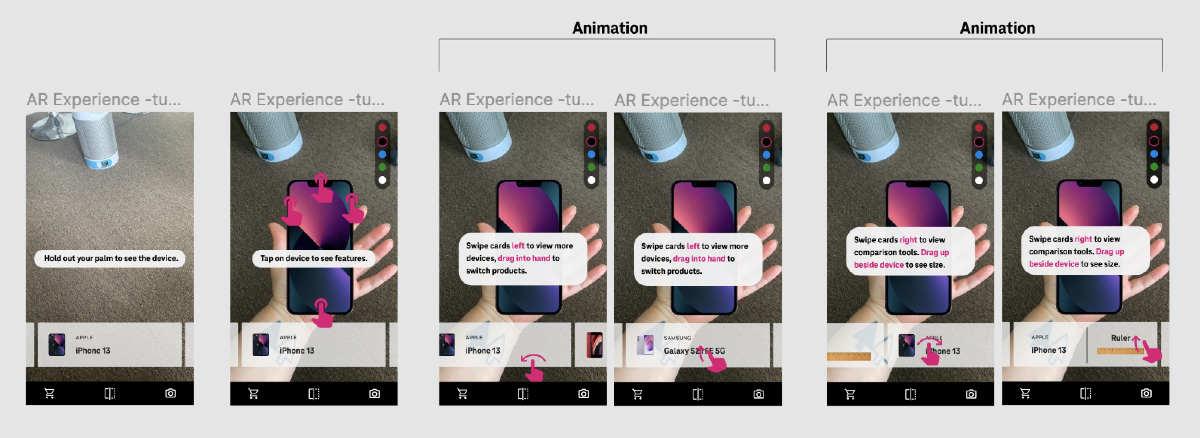
Future (Shopping Experience)
- Compare devices
- Switch products
- Add to cart
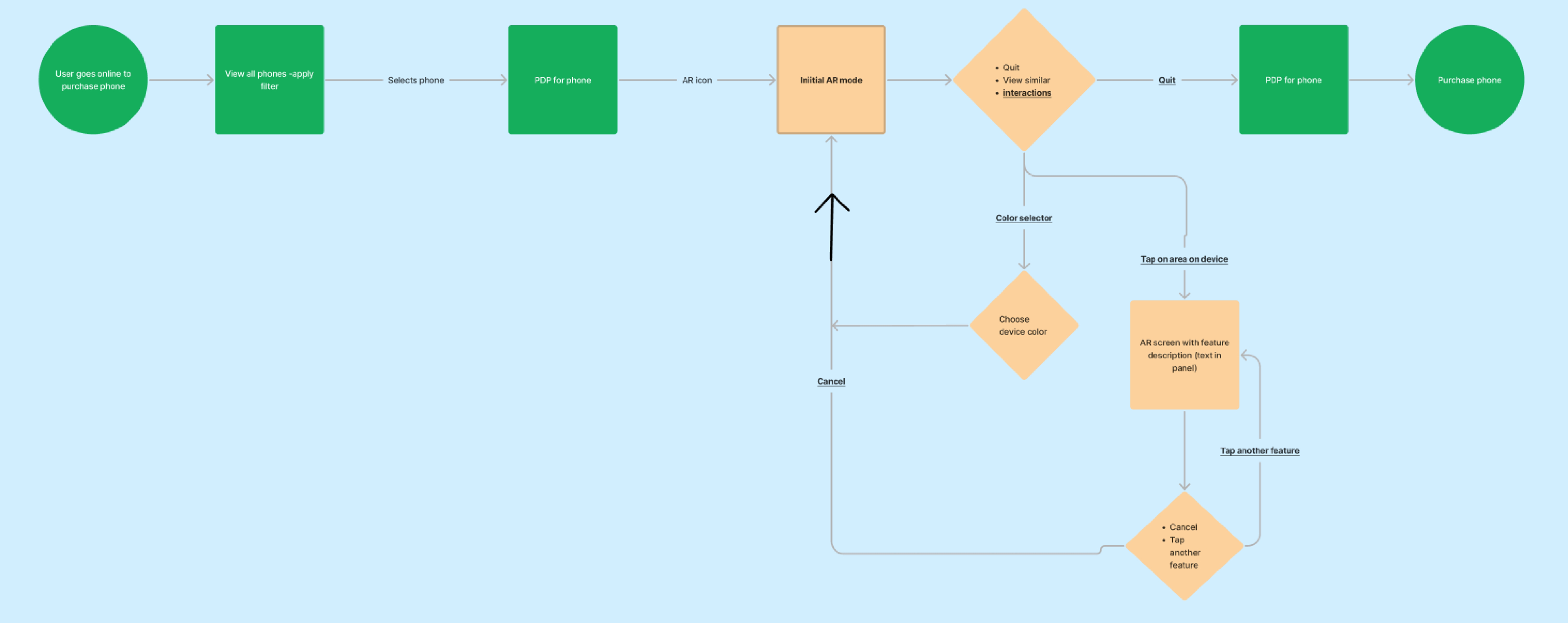
User flow
Key decision
Separated the experience into
- Browsing (low friction, exploratory)
- Shopping (higher complexity, transactional)
Design
Approach
- Designed flows and prototypes in Figma, later adapting to Photoshop for AR dev collaboration
- Created end-to-end user flows including entry points from e-commerce
- Iterated through multiple rounds of usability testing
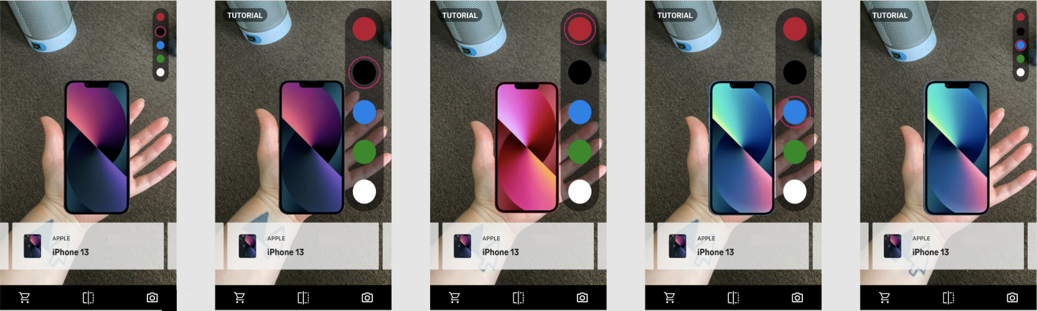
Color selection
Flip
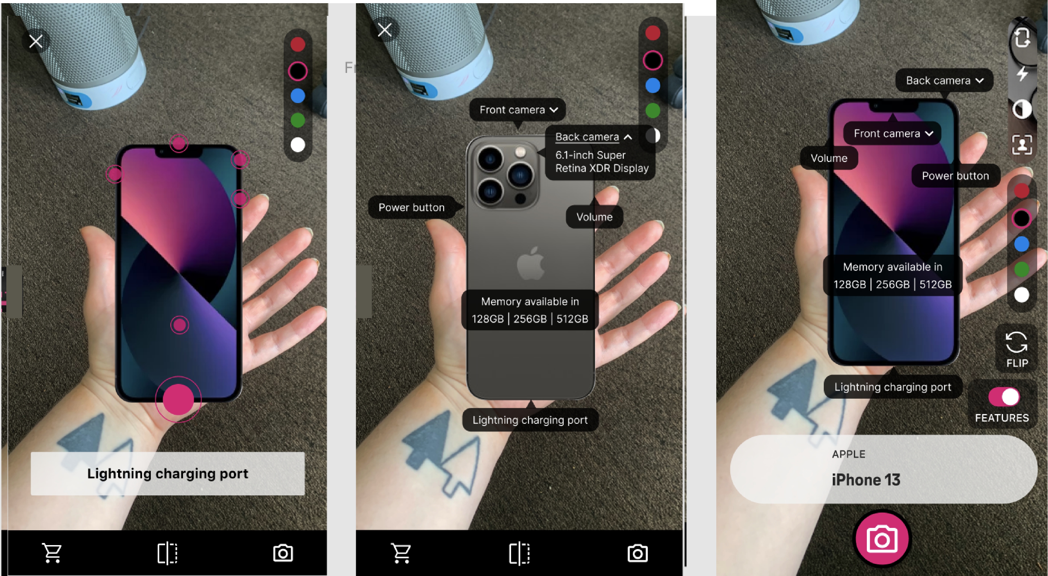
Feature highlights
Tutorial
Key decisions
Interaction Patterns
- Designed intuitive gestures for:
- Rotating and flipping devices
- Exploring features
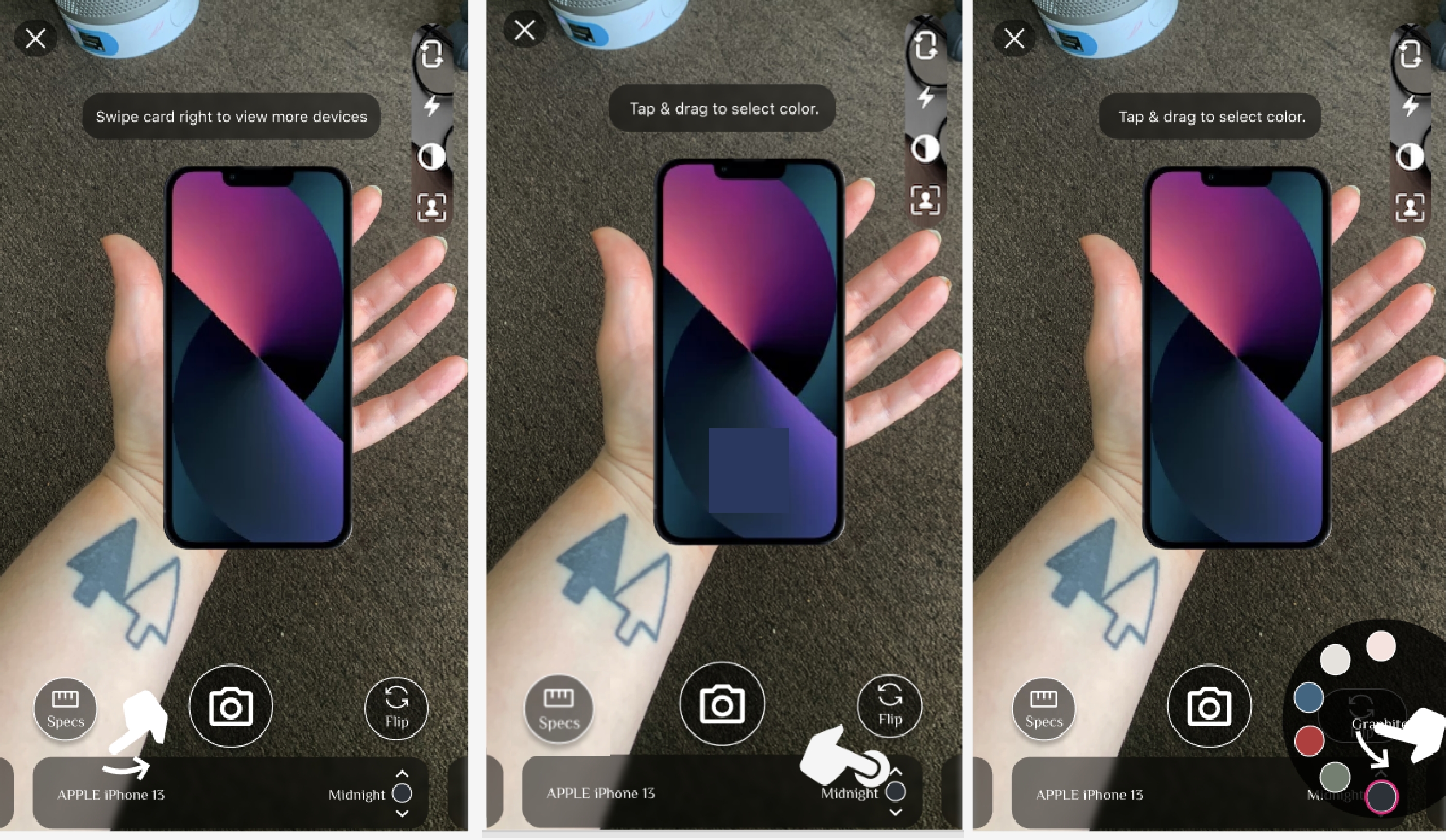
- Tested different models for color selection (tap vs. drag)
Onboarding & Tutorial
- Explored multiple triggers (auto-launch vs. user-initiated)
- Balanced guidance vs. interruption
Feature Prioritization
- Cut “Add to Cart” from MVP due to complexity vs. value tradeoff
- Focused on confidence-building interactions first
Accessibility Considerations
- Explored left-handed support (“switch hands”)
- Advocated for legibility and contrast improvements
MVP Browsing experience
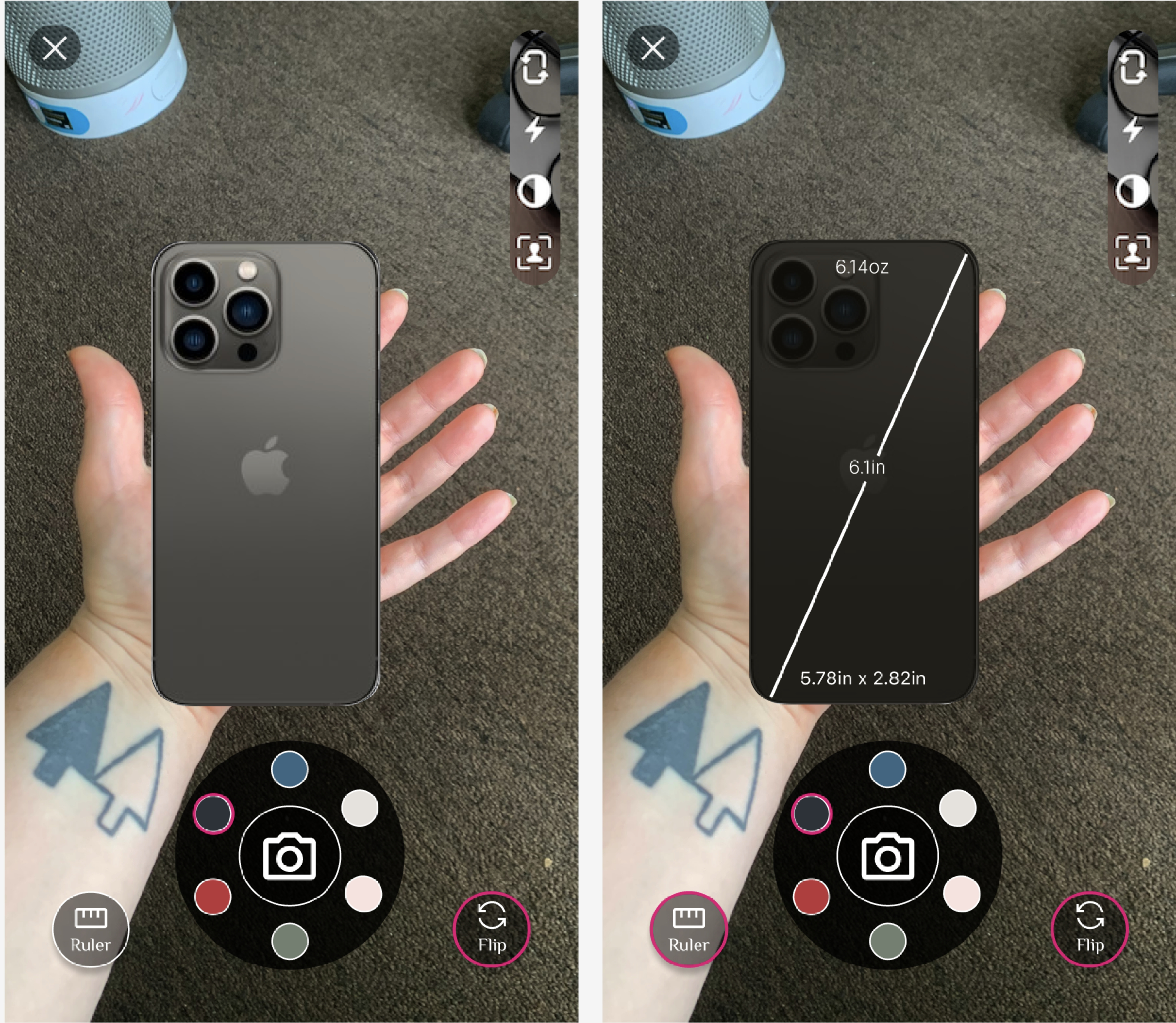
UI option 1 | Ruler feature pictured
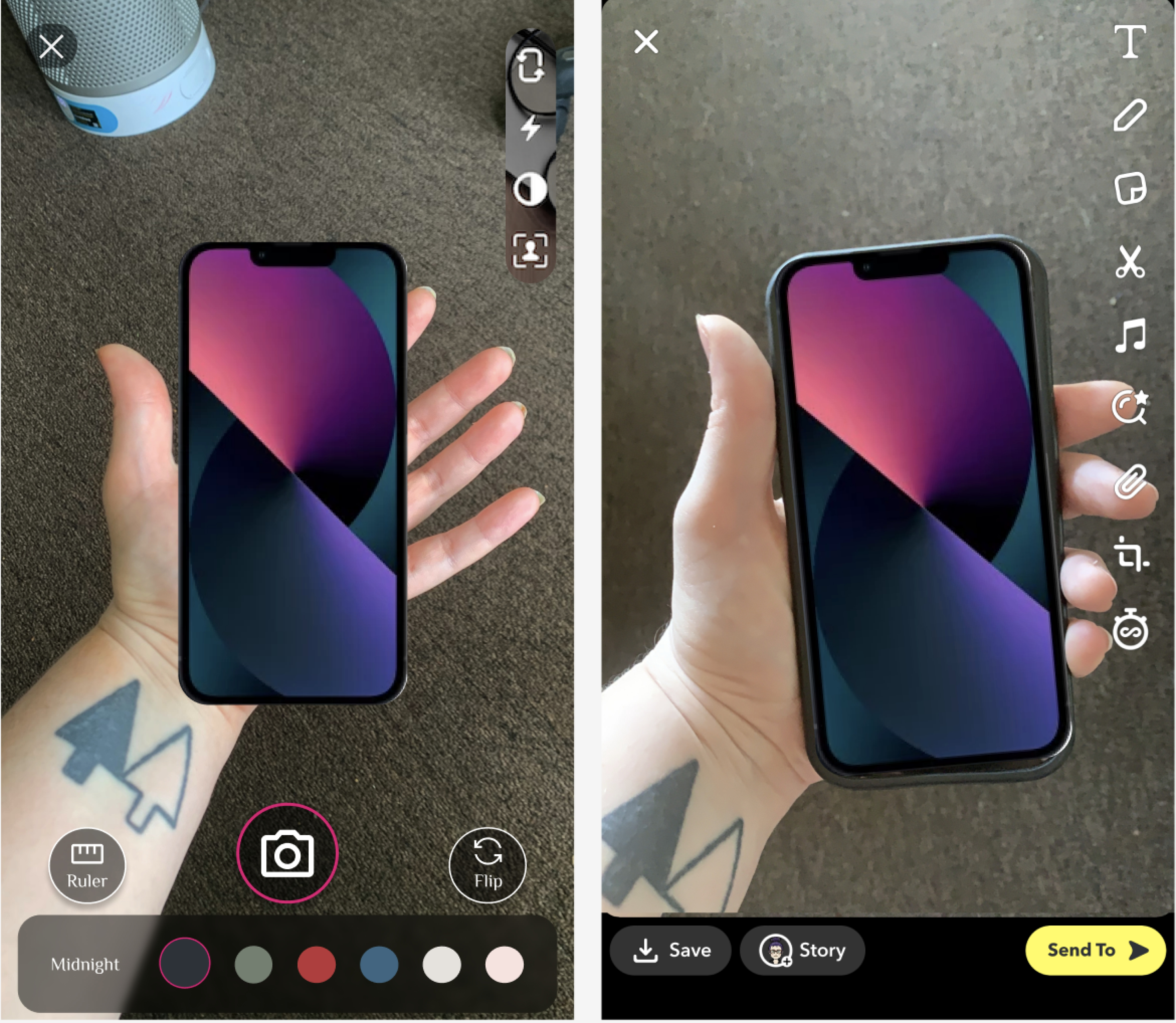
UI option 2 | Share feature pictured
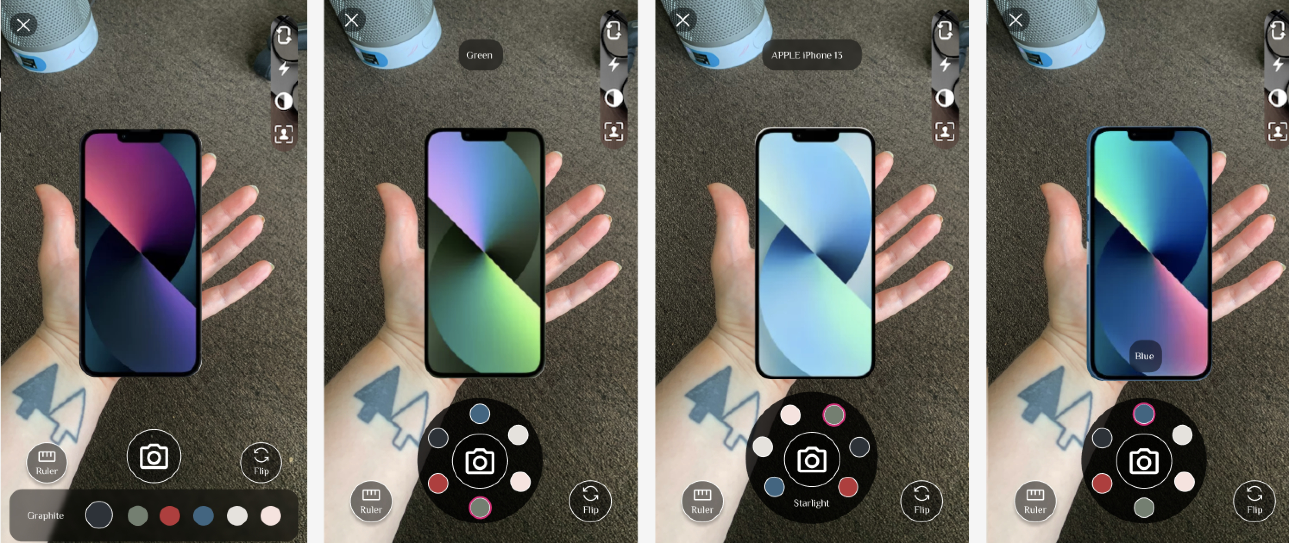
Color selection options
UI option 2 | Share feature pictured
Roadmapped shopping experience
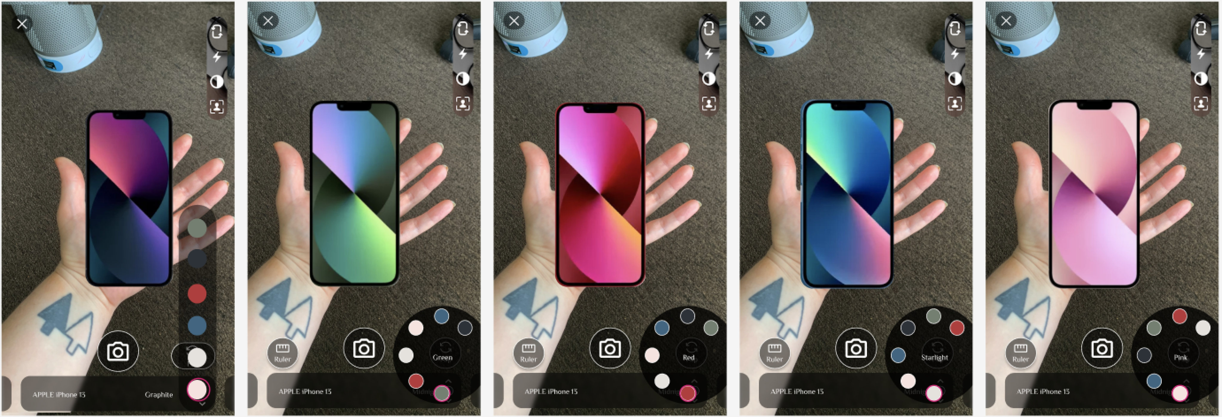
Color options | Bottom UI addition - ability to scroll through phones in AR feature
Delivery
What I delivered
- High-fidelity UI adapted for AR constraints
- Interaction specs and iterative design updates
- Support in feedback loop & QA between design, stakeholders, and developers
Final refinements
- Simplified UI for clarity in AR environment
- Adjusted interaction models based on feasibility
- Roadmap for shopping experience & Fun Mode