
Add-Ons & Benefits
Increasing discovery & engagement across T-Mobile’s subscriptions experiences to reflect how customers think and decide

| Lead Designer | Subscriptions | App & Web
Summary
The current flows customers used to add and manage add-ons & benefits were fragmented and inaccessible.
As benefit options for customer grew, pages, sections, & links had been added without considering the entire flow. Multiple marketing-driven pages added to this disconnect.
Key challenges
- Company wide initiative with a large amount of visibility → Many conflicting stakeholder priorities & evolving requirements
- User mental models vs system complexity; products were organized by outdated backend logic, not human logic
My role
- Led web design
- Negotiated stakeholder tradeoffs
- Worked closely with the Benefits and Ecom Team to ensure alignment

Problem
Users struggled to understand what add-ons, benefits, data, and subscriptions they even had access to, what was available, and how to manage them.
This initiative brought more add-ons. And an entire classification: Dynamic discounted benefits based on the customer’s rate plan and what they already had.
As requirements evolved, there were so many moving pieces and past one-off quick fixes confusing things, the teams barely knew what was a benefit vs add-on vs subscription. But was tacked onto scope, there was a deeper challenge:
“How might we condense fragmented add-on experiences while creating a system for paid, free, & discounted benefits in a way that is scalable and feels intuitive & cohesive?”
Solution
A unified Add-Ons experience that brings all paid, free, and discounted add-ons, subscriptions, data, and benefits into a single, intuitive destination, allowing users to see what they have, explore available options, and manage subscriptions seamlessly.

Discover
What I did
- Conducted competitive analysis of subscription and add-on experiences
- Ran contextual inquiry to understand user confusion and behaviors
- Facilitated stakeholder conversations across product and marketing
- Used affinity mapping to synthesize findings
Key insights
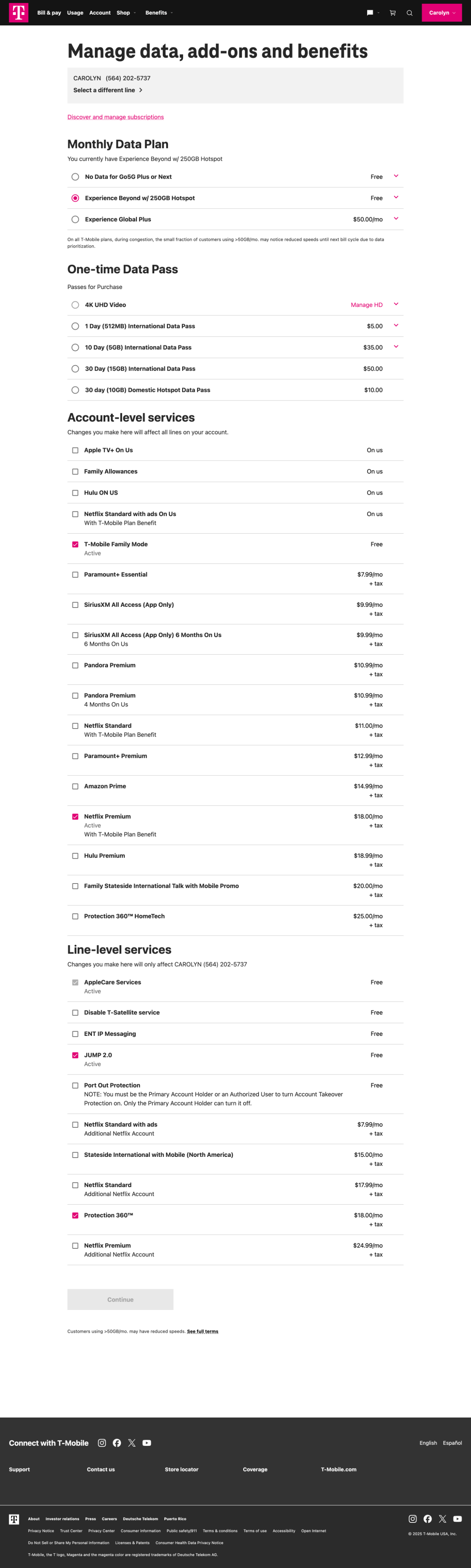
- Users couldn’t distinguish between what they have vs what they can get
- Fragmented entry points created decision fatigue and confusion
- Mixing subscriptions with unrelated products broke mental models
- Users think in terms of “my services” vs “available services”, not internal categories
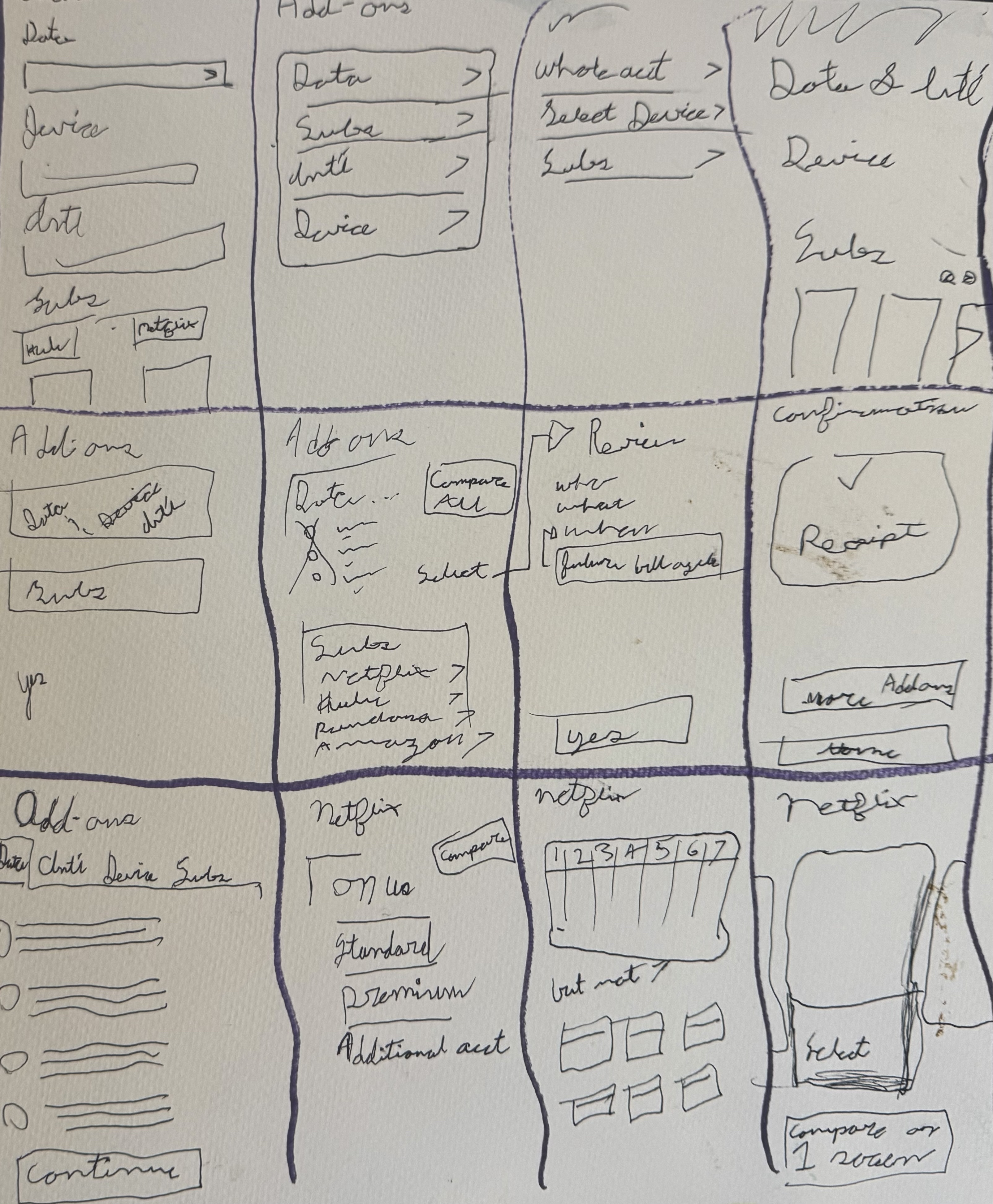
Before

Sketches
Define
Stakeholder alignment
- Collaborated with product and marketing amid rapidly changing requirements
- Aligned on supporting a new benefits-based initiative tied to plans
- Navigated differing perspectives on separating vs unifying experiences
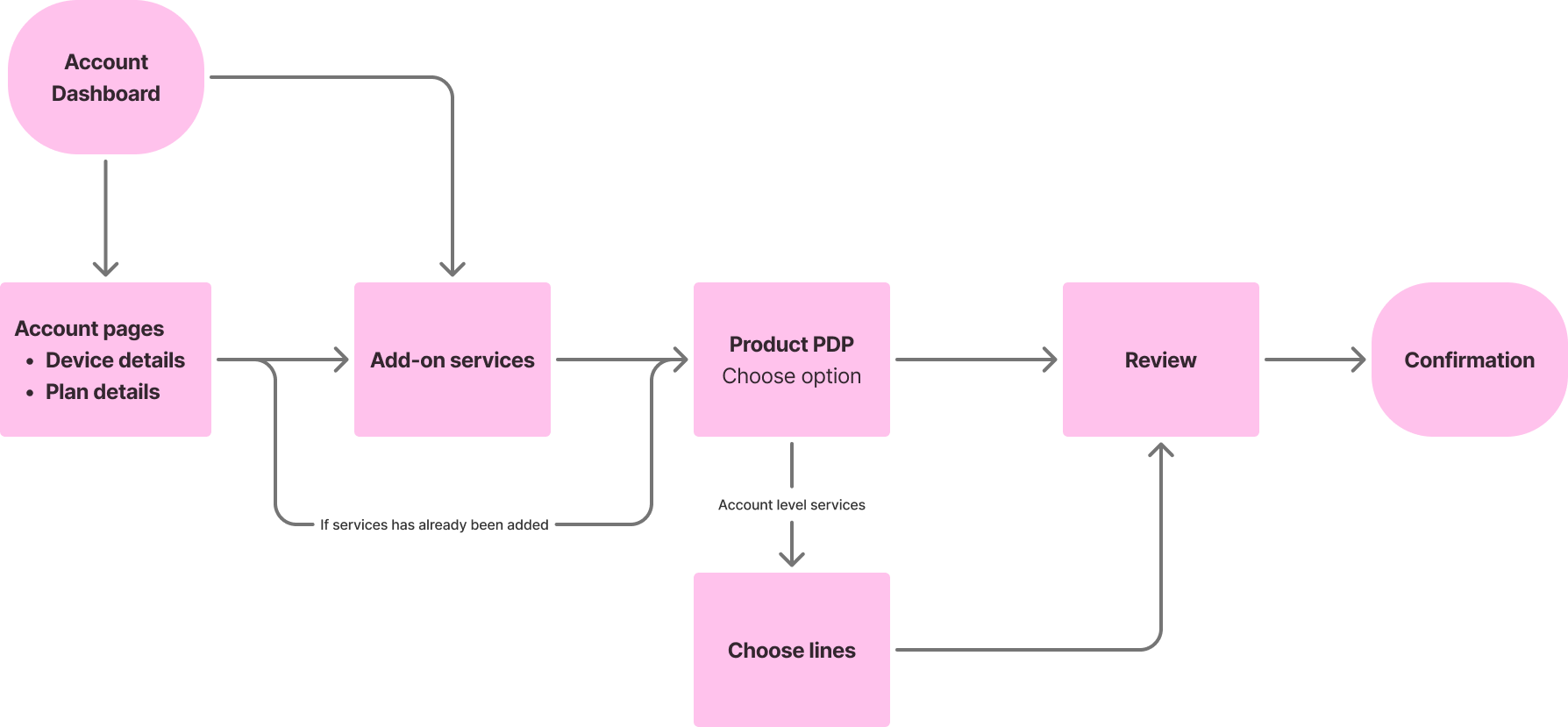
Flow chart
Features
- View and manage active services
- Browse available add-ons and benefits
- Handle multi-line selection for third-party add-ons
- Support free, discounted, and paid subscriptions
- Enable tier selection, upgrades, cancellations, and benefit swaps
Key decision
Unify add-ons and benefits into a single experience
Despite pressure to separate them, I advocated for one destination—aligning with user expectations and reducing complexity.
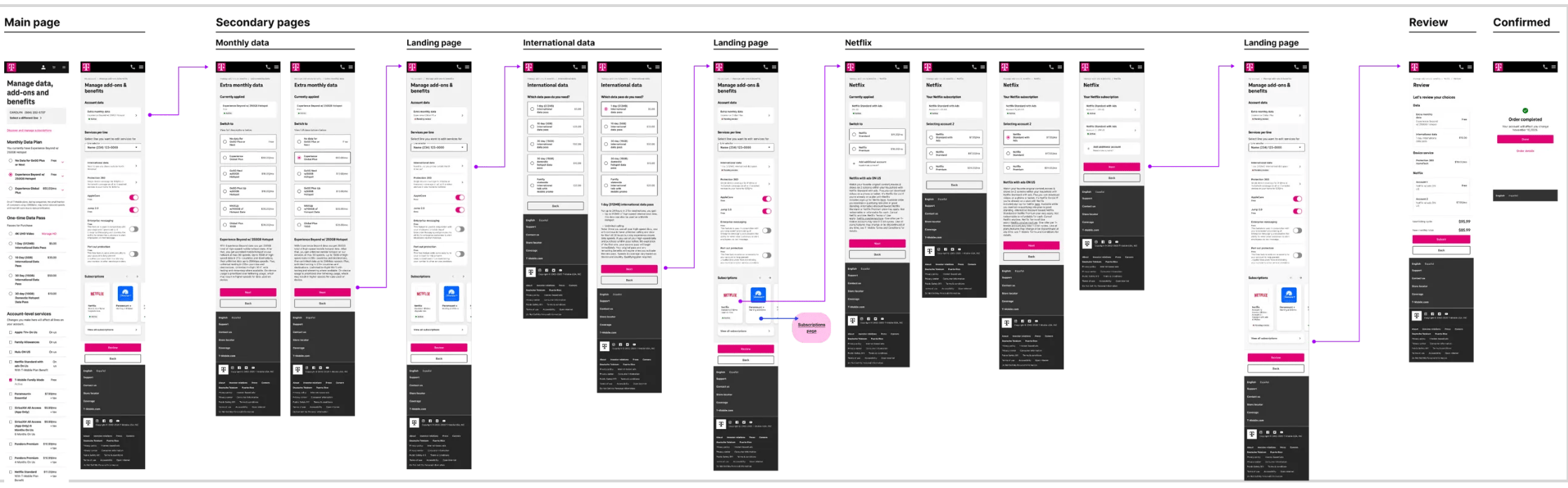
Initial concept
Design
Approach
- Explored both separate and unified models through wireframes
- Designed for flexibility across multiple service states
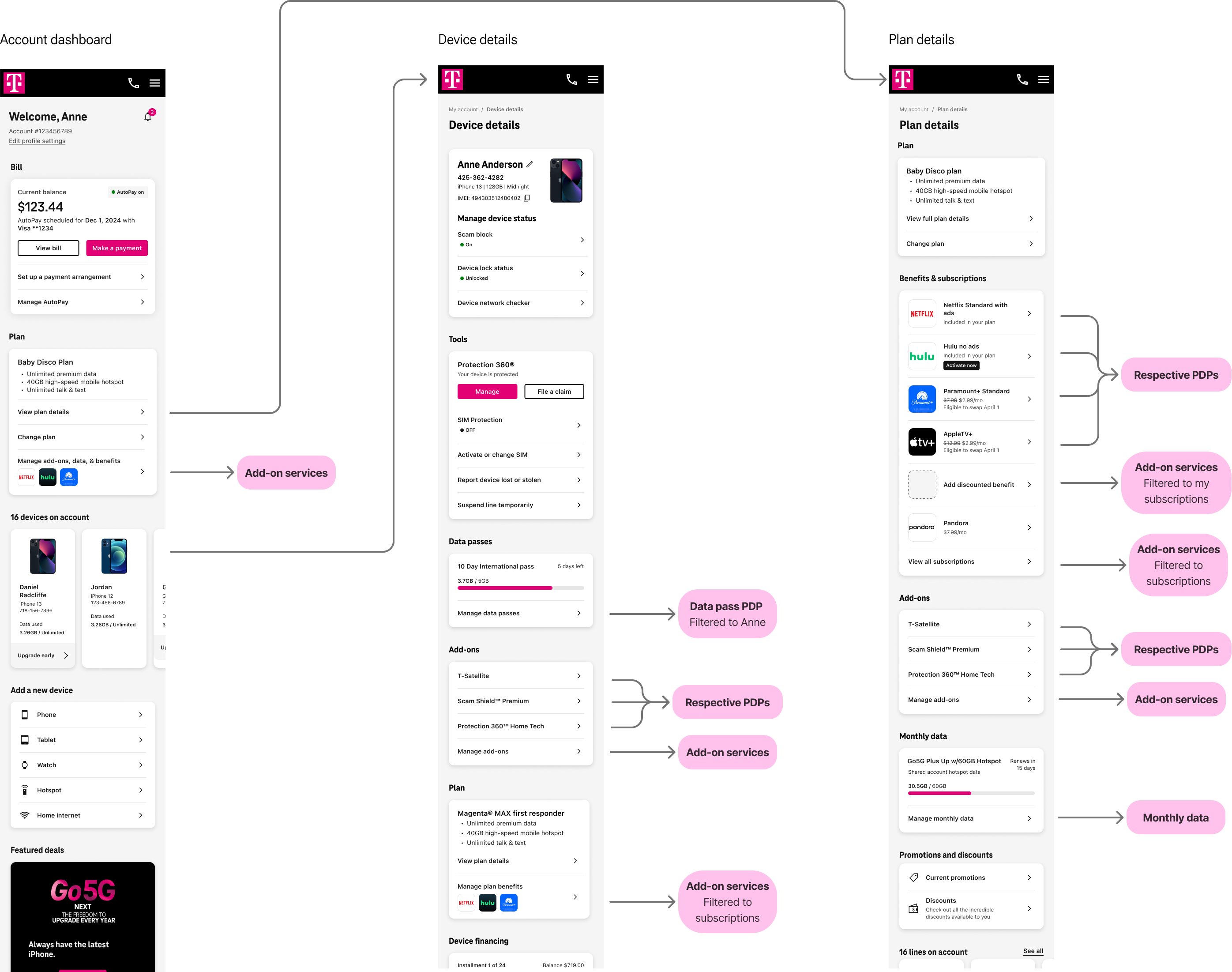
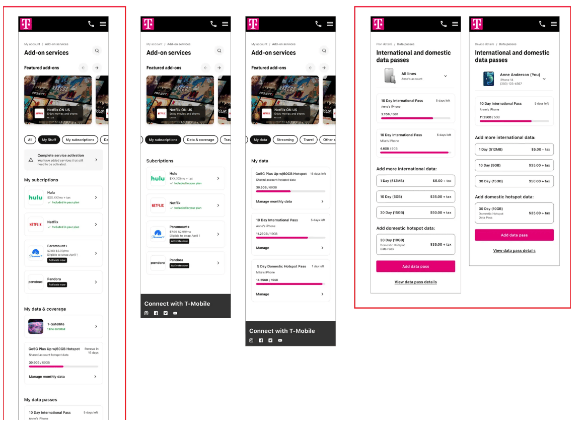
- Simplified navigation by consolidating entry points (dashboard + plan details)
- Created scalable patterns for service cards and detail views
Entry points
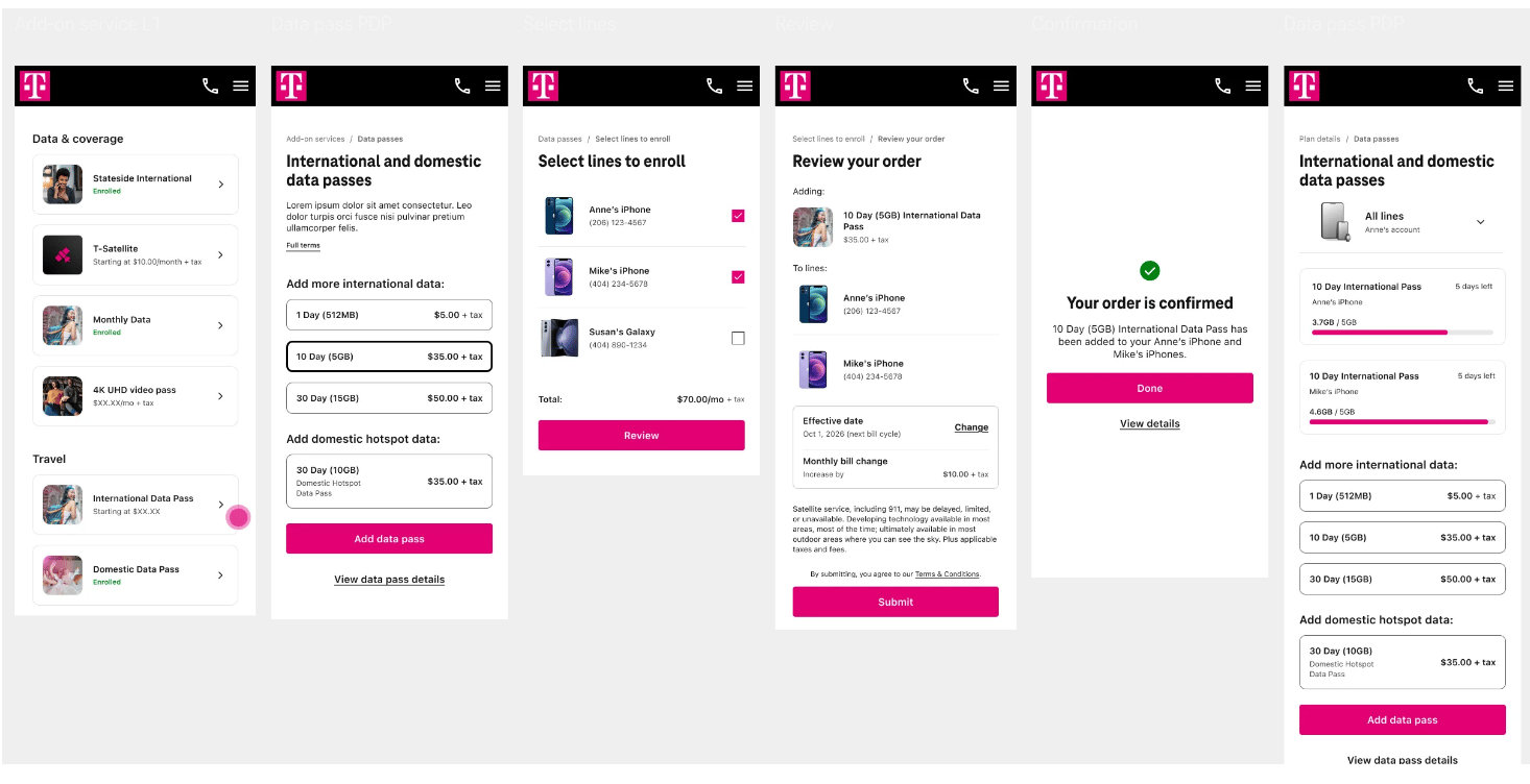
Add-on service L1
Key decisions
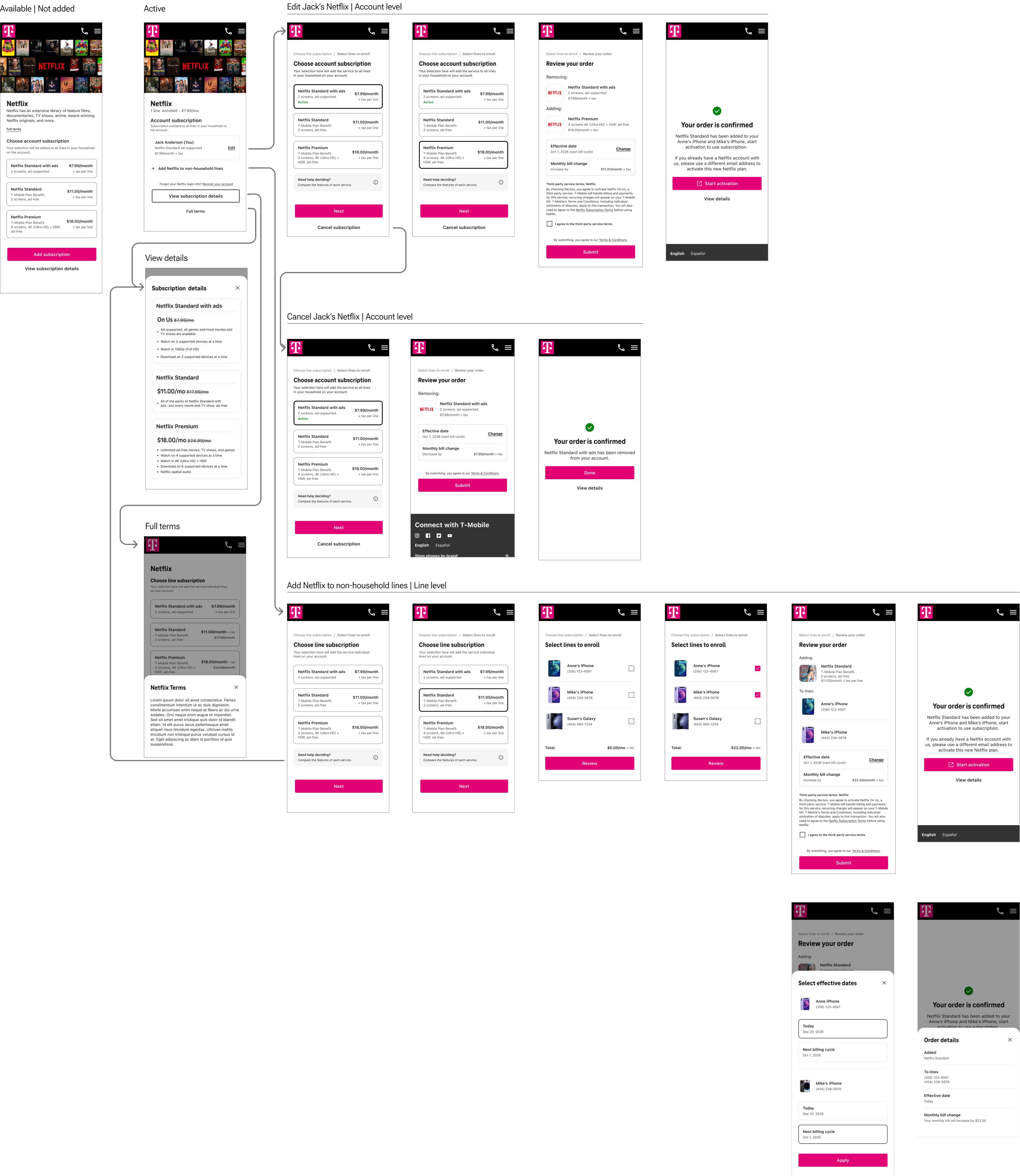
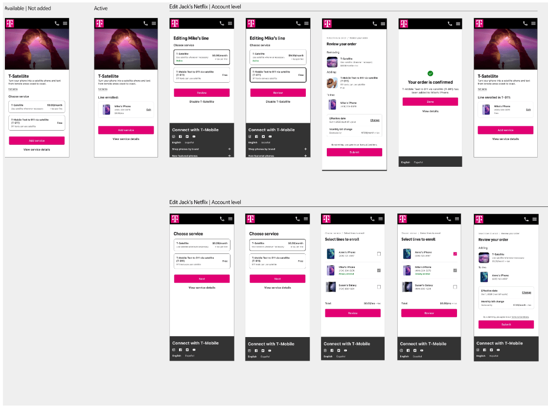
Design product description page for dynamic states at the service level, not separate flows
This enabled a single system to handle:
- Active vs available
- Free vs discounted vs paid
- Upgrade, cancel, and swap actions
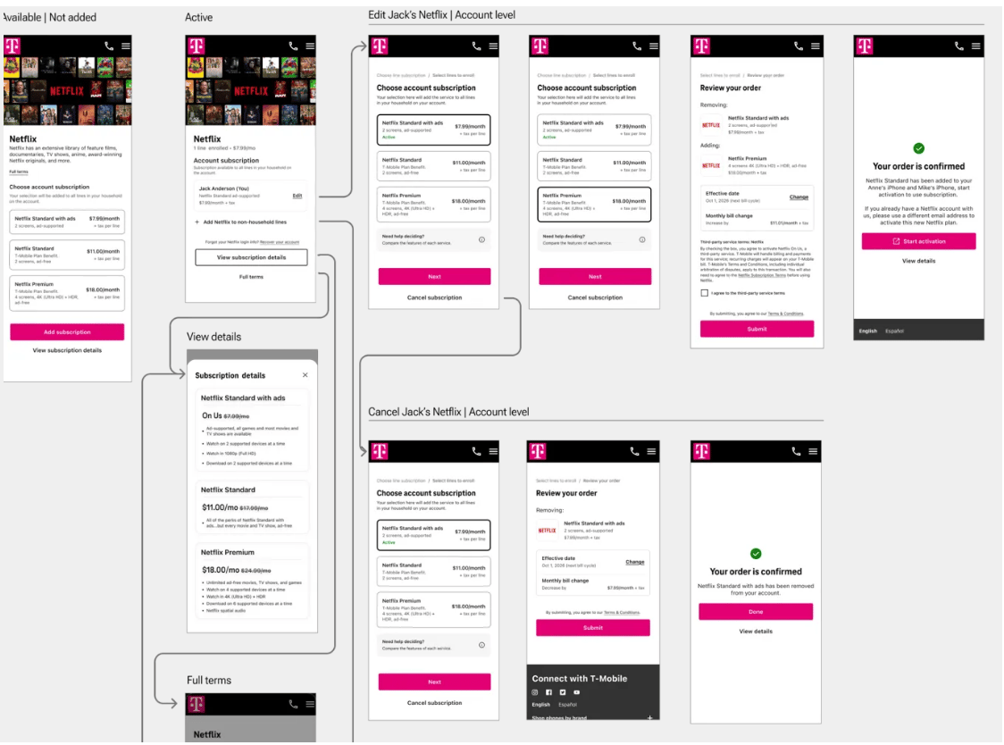
Netflix | Third party
T-Satellite | First party
Deliver
What I delivered
- End-to-end user flows and high-fidelity designs
- Scalable patterns for add-ons and benefits management
- Cross-functional alignment with product and marketing
Final refinements
- Iterated on the unified model as requirements evolved
- Refined interaction states and edge cases (tiers, swaps, eligibility)
- Prepared designs for user testing and validation
Project was in progress at time of transition, with strong alignment on direction and next steps.


Add-Ons & Benefits
Increasing discovery & engagement across T-Mobile’s subscriptions experiences to reflect how customers think and decide
| Lead Designer | Subscriptions | App & Web
Summary
The current flows customers used to add and manage add-ons & benefits were fragmented and inaccessible.
As benefit options for customer grew, pages, sections, & links had been added without considering the entire flow. Multiple marketing-driven pages added to this disconnect.
Key challenges
- Company wide initiative with a large amount of visibility → Many conflicting stakeholder priorities & evolving requirements
- User mental models vs system complexity; products were organized by outdated backend logic, not human logic
My role
- Led web design
- Negotiated stakeholder tradeoffs
- Worked closely with the Benefits and Ecom Team to ensure alignment
Problem
Users struggled to understand what add-ons, benefits, data, and subscriptions they even had access to, what was available, and how to manage them.
This initiative brought more add-ons. And an entire classification: Dynamic discounted benefits based on the customer’s rate plan and what they already had.
As requirements evolved, there were so many moving pieces and past one-off quick fixes confusing things, the teams barely knew what was a benefit vs add-on vs subscription. But was tacked onto scope, there was a deeper challenge:
“How might we condense fragmented add-on experiences while creating a system for paid, free, & discounted benefits in a way that is scalable and feels intuitive & cohesive?”
Solution
A unified Add-Ons experience that brings all paid, free, and discounted add-ons, subscriptions, data, and benefits into a single, intuitive destination, allowing users to see what they have, explore available options, and manage subscriptions seamlessly.
Discover
What I did
- Conducted competitive analysis of subscription and add-on experiences
- Ran contextual inquiry to understand user confusion and behaviors
- Facilitated stakeholder conversations across product and marketing
- Used affinity mapping to synthesize findings
Key insights
- Users couldn’t distinguish between what they have vs what they can get
- Fragmented entry points created decision fatigue and confusion
- Mixing subscriptions with unrelated products broke mental models
- Users think in terms of “my services” vs “available services”, not internal categories
Before
Sketches
Define
Stakeholder alignment
- Collaborated with product and marketing amid rapidly changing requirements
- Aligned on supporting a new benefits-based initiative tied to plans
- Navigated differing perspectives on separating vs unifying experiences
Flow chart
Features
- View and manage active services
- Browse available add-ons and benefits
- Handle multi-line selection for third-party add-ons
- Support free, discounted, and paid subscriptions
- Enable tier selection, upgrades, cancellations, and benefit swaps
Key decision
Unify add-ons and benefits into a single experience
Despite pressure to separate them, I advocated for one destination—aligning with user expectations and reducing complexity.
Initial concept
Design
Approach
- Explored both separate and unified models through wireframes
- Designed for flexibility across multiple service states
- Simplified navigation by consolidating entry points (dashboard + plan details)
- Created scalable patterns for service cards and detail views
Entry points
Add-on service L1
Key decisions
Design product description page for dynamic states at the service level, not separate flows
This enabled a single system to handle:
- Active vs available
- Free vs discounted vs paid
- Upgrade, cancel, and swap actions
Netflix | Third party
T-Satellite | First party
Data passes
Deliver
What I delivered
- End-to-end user flows and high-fidelity designs
- Scalable patterns for add-ons and benefits management
- Cross-functional alignment with product and marketing
Final refinements
- Iterated on the unified model as requirements evolved
- Refined interaction states and edge cases (tiers, swaps, eligibility)
- Prepared designs for user testing and validation
Project was in progress at time of transition, with strong alignment on direction and next steps.

Add-Ons & Benefits
Increasing discovery & engagement across T-Mobile’s subscriptions experiences to reflect how customers think and decide
| Lead Designer | Subscriptions | App & Web
Summary
The current flows customers used to add and manage add-ons & benefits were fragmented and inaccessible.
As benefit options for customer grew, pages, sections, & links had been added without considering the entire flow. Multiple marketing-driven pages added to this disconnect.
Key challenges
- Company wide initiative with a large amount of visibility → Many conflicting stakeholder priorities & evolving requirements
- User mental models vs system complexity; products were organized by outdated backend logic, not human logic
My role
- Led web design
- Negotiated stakeholder tradeoffs
- Worked closely with the Benefits and Ecom Team to ensure alignment
Problem
Users struggled to understand what add-ons, benefits, data, and subscriptions they even had access to, what was available, and how to manage them.
This initiative brought more add-ons. And an entire classification: Dynamic discounted benefits based on the customer’s rate plan and what they already had.
As requirements evolved, there were so many moving pieces and past one-off quick fixes confusing things, the teams barely knew what was a benefit vs add-on vs subscription. But was tacked onto scope, there was a deeper challenge:
“How might we condense fragmented add-on experiences while creating a system for paid, free, & discounted benefits in a way that is scalable and feels intuitive & cohesive?”
Solution
A unified Add-Ons experience that brings all paid, free, and discounted add-ons, subscriptions, data, and benefits into a single, intuitive destination, allowing users to see what they have, explore available options, and manage subscriptions seamlessly.
Discover
What I did
- Conducted competitive analysis of subscription and add-on experiences
- Ran contextual inquiry to understand user confusion and behaviors
- Facilitated stakeholder conversations across product and marketing
- Used affinity mapping to synthesize findings
Key insights
- Users couldn’t distinguish between what they have vs what they can get
- Fragmented entry points created decision fatigue and confusion
- Mixing subscriptions with unrelated products broke mental models
- Users think in terms of “my services” vs “available services”, not internal categories
Before
Sketches
Define
Stakeholder alignment
- Collaborated with product and marketing amid rapidly changing requirements
- Aligned on supporting a new benefits-based initiative tied to plans
- Navigated differing perspectives on separating vs unifying experiences
Flow chart
Features
- View and manage active services
- Browse available add-ons and benefits
- Handle multi-line selection for third-party add-ons
- Support free, discounted, and paid subscriptions
- Enable tier selection, upgrades, cancellations, and benefit swaps
Key decision
Unify add-ons and benefits into a single experience
Despite pressure to separate them, I advocated for one destination—aligning with user expectations and reducing complexity.
Initial concept
Design
Approach
- Explored both separate and unified models through wireframes
- Designed for flexibility across multiple service states
- Simplified navigation by consolidating entry points (dashboard + plan details)
- Created scalable patterns for service cards and detail views
Entry points
Add-on service L1
Key decisions
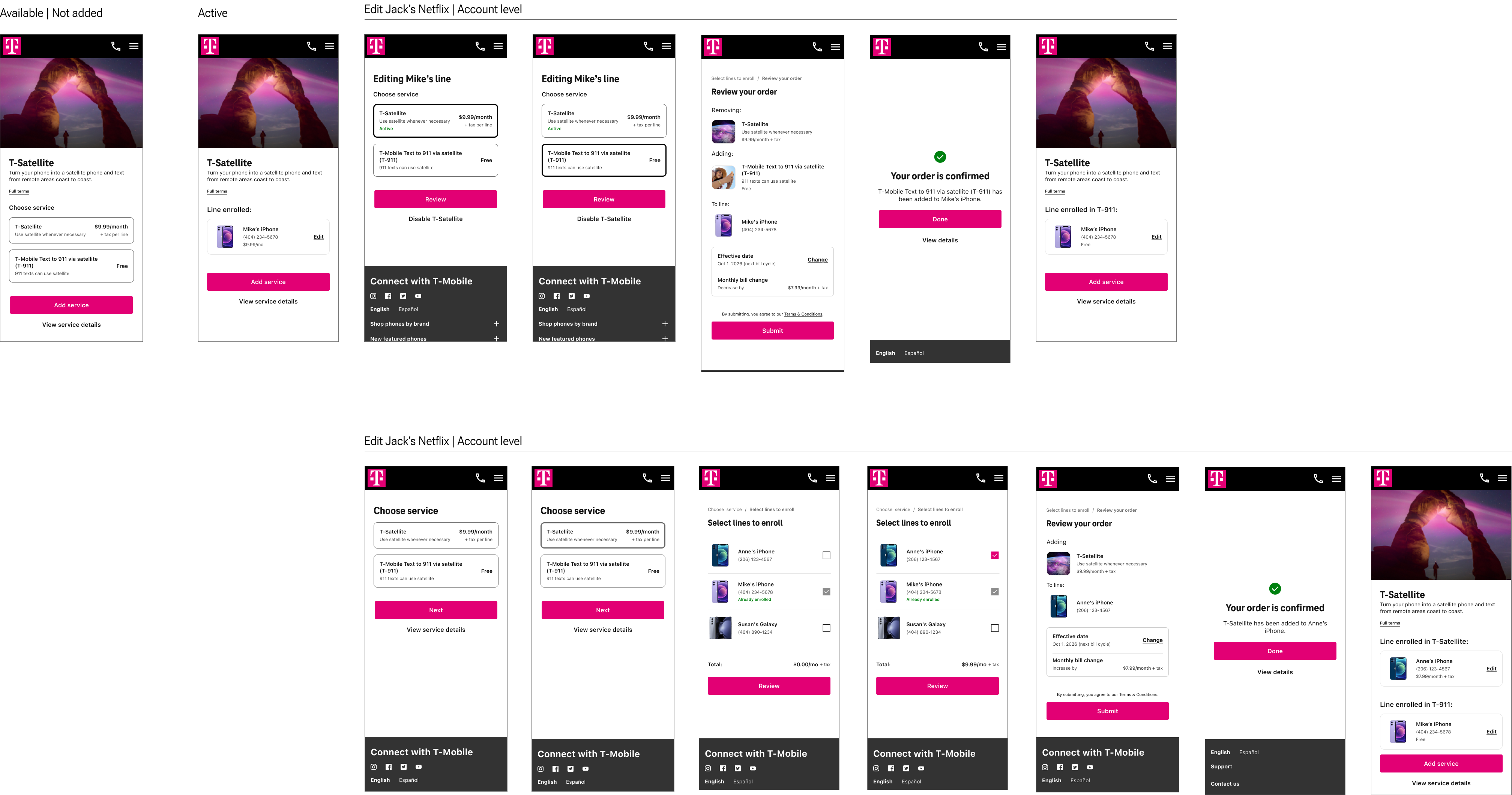
Design product description page for dynamic states at the service level, not separate flows
This enabled a single system to handle:
- Active vs available
- Free vs discounted vs paid
- Upgrade, cancel, and swap actions
Netflix | Third party
T-Satellite | First party
Data passes
Deliver
What I delivered
- End-to-end user flows and high-fidelity designs
- Scalable patterns for add-ons and benefits management
- Cross-functional alignment with product and marketing
Final refinements
- Iterated on the unified model as requirements evolved
- Refined interaction states and edge cases (tiers, swaps, eligibility)
- Prepared designs for user testing and validation
Project was in progress at time of transition, with strong alignment on direction and next steps.