
Add-Ons & Benefits
Designed a 0-to-1 SaaS platform that unified 6 disconnected audit phases into a collaborative workspace, reducing a 100+ hour workflow to 10 hours
People Tech Group | UX Designer | Web | B2B, Workflow & Systems

What makes this project unique?
- Enterprise SaaS platform reimagining the entire audit engagement lifecycle into a single collaborative platform
- Connected people, documents, approvals, and audit data in one shared workspace, eliminating fragmented tools and manual handoffs
- Designed for multiple user roles with distinct permissions, workflows, and responsibilities. (clients, accountants, reviewers, administrators)
- Reduced context switching by embedding collaboration tools directly within the workflow instead of relying on email and external document sharing.
My role
- Design strategy & problem alignment
- User roles & workflows definition
- Visual iterations, user testing, & final designs

Problem
Users struggled to understand what add-ons, benefits, data, and subscriptions they even had access to, what was available, and how to manage them.
This initiative brought more add-ons. And an entire classification: Dynamic discounted benefits based on the customer’s rate plan and what they already had.
As requirements evolved, there were so many moving pieces and past one-off quick fixes confusing things, the teams barely knew what was a benefit vs add-on vs subscription. But was tacked onto scope, there was a deeper challenge:
“How might we condense fragmented add-on experiences while creating a system for paid, free, & discounted benefits in a way that is scalable and feels intuitive & cohesive?”
Solution
We redesigned the audit engagement as a single, collaborative workflow instead of a collection of disconnected tasks.
To give auditors a single source of truth and support real-time collaboration, we unified:
- Client onboarding
- Engagement letters
- Trial balance
- Audit procedures
- Financial statements
- Reporting
To collaborate between user roles, we designed reusable interaction patterns for:
- Document review
- Issue tracking
- Comments
- Approvals

Discover
What I did
- Conducted competitive analysis of subscription and add-on experiences
- Ran contextual inquiry to understand user confusion and behaviors
- Facilitated stakeholder conversations across product and marketing
- Used affinity mapping to synthesize findings
Key insights
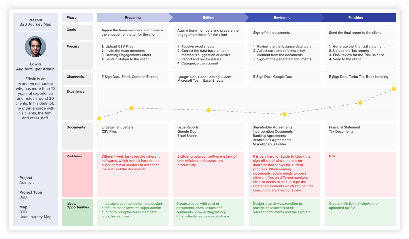
- Conducted stakeholder workshops with the client and a team of practicing auditors to map the existing NTR engagement process from end to end
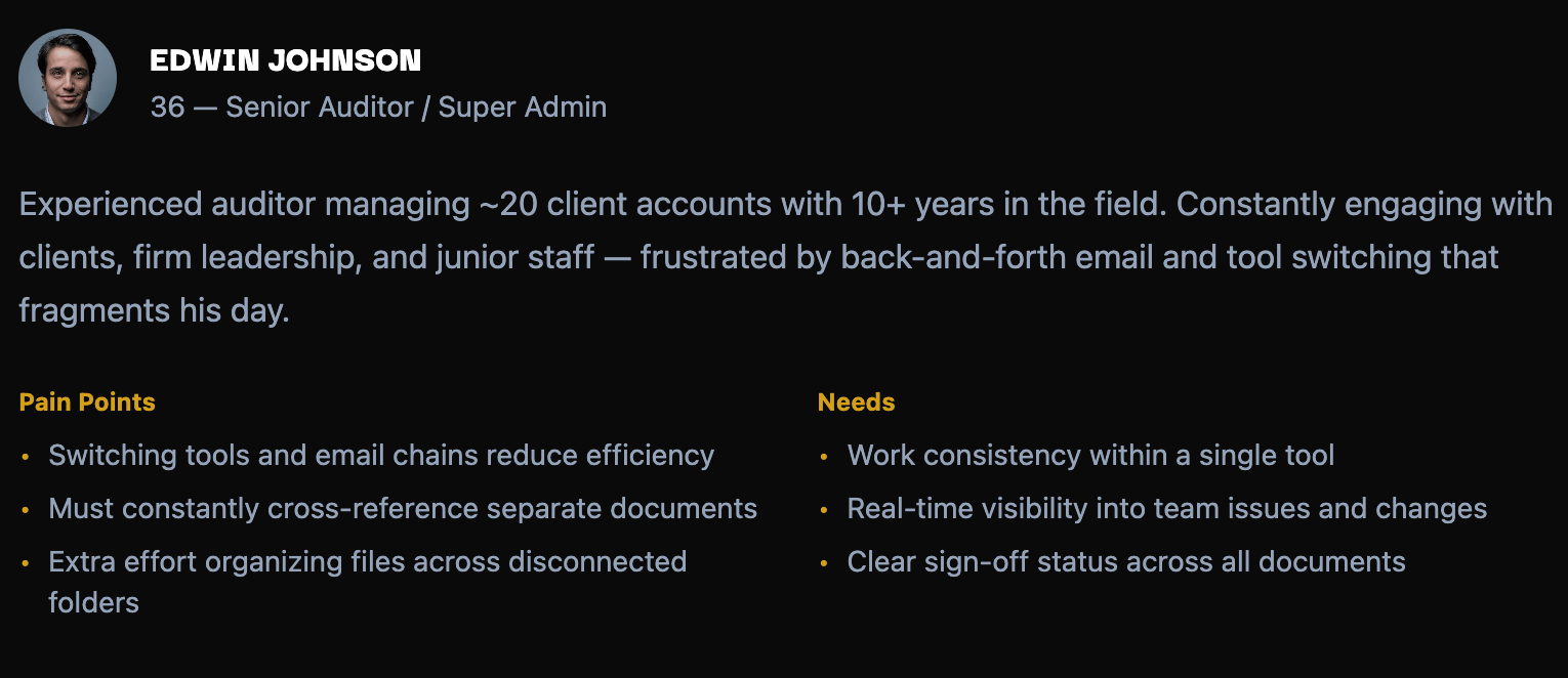
- Created the primary persona; representing the Senior Auditor / Super Admin who touched every module and step in Adinovis
Persona
Define
What I did
- Collaborated with product and marketing amid rapidly changing requirements
- Aligned on supporting a new benefits-based initiative tied to plans
- Navigated differing perspectives on separating vs unifying experiences
Current customer journey
Features
Client Onboarding
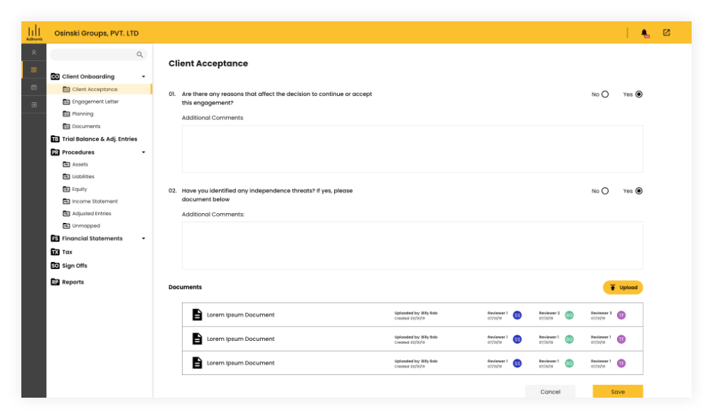
- Compliance questions
- Document upload
- Reviewer assignment
Engagement Letters
- Digital letter generation
- Sign-off tracking
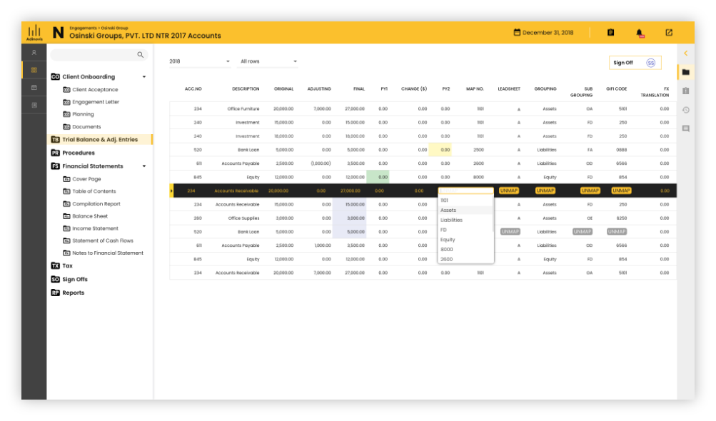
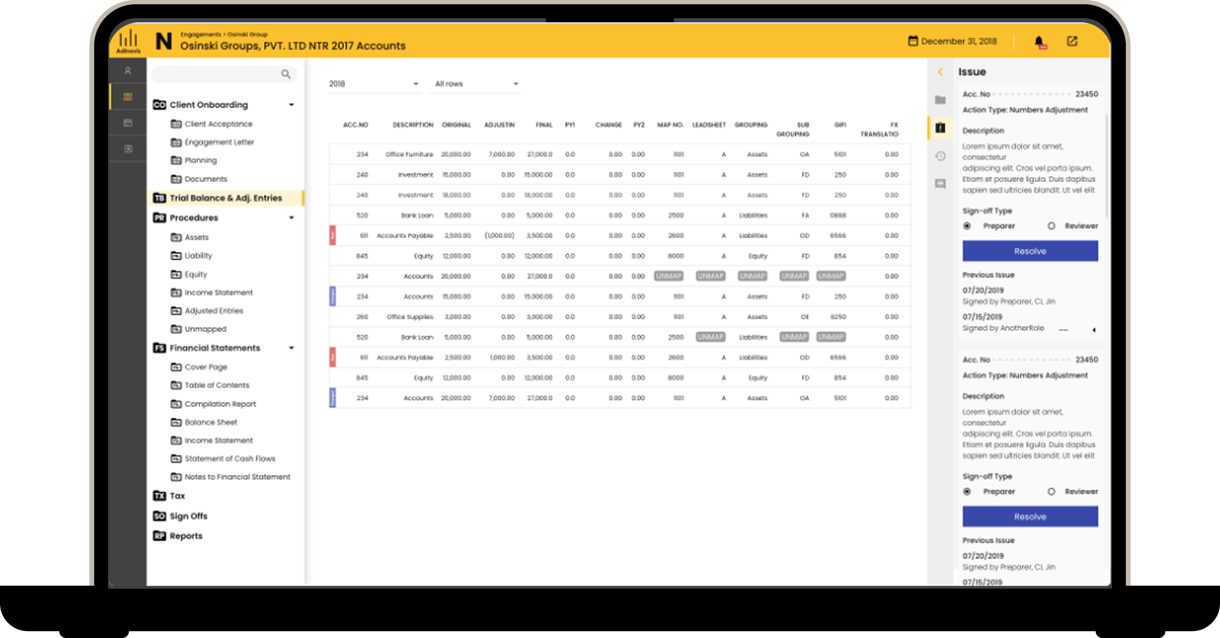
Trial Balance
- CSV import
- Account mapping
- UNMAP flagging
- Section sign-offs
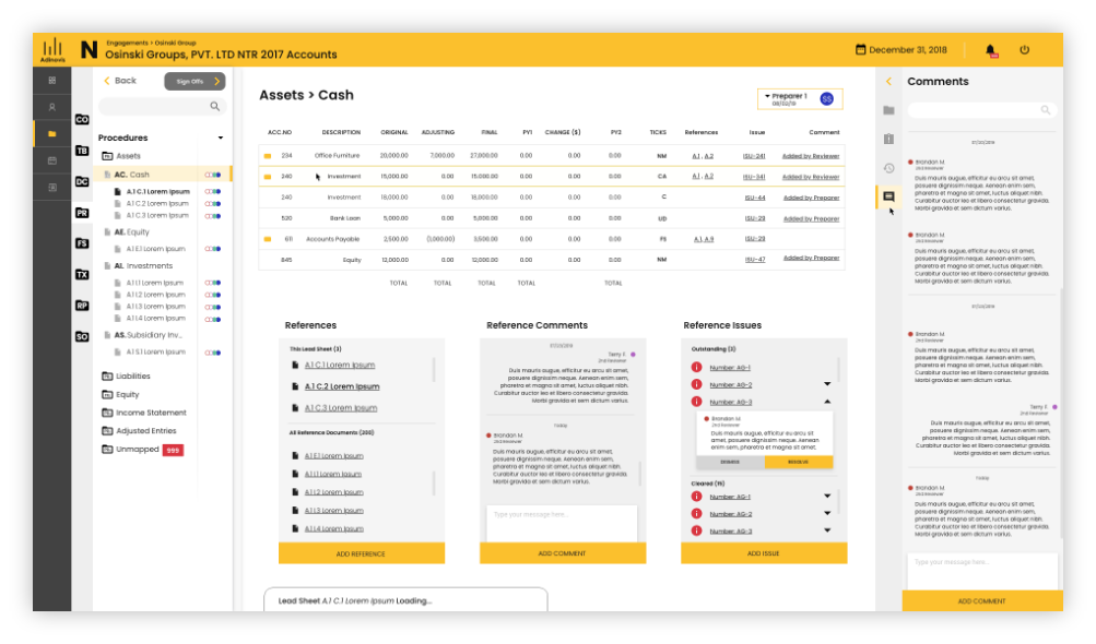
Procedures
- Account categorization across Assets, Liabilities, Equity, Income, Expense
- Inline reference tracking
Financial Statements
- Structured financial data with collaborative review
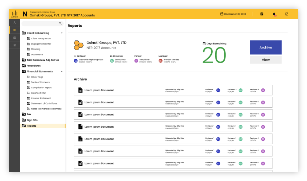
Reports
- Final report generation
- Reviewer assignments
- Client delivery archive
Right-hand panel
- Persistent Issues
- Comments
- History panel
Global notification
- Issues
- Notifications
- Notes
Navigation
- Initial-letter coded folder icons matching auditor mental models
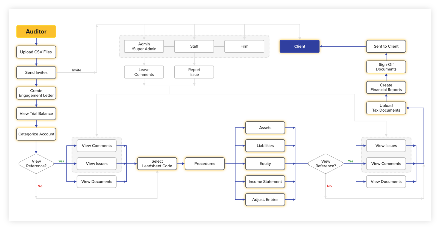
Userflow
Key decisions
Unify add-ons and benefits into a single experience
Despite pressure to separate them, I advocated for one destination—aligning with user expectations and reducing complexity.
Client Onboarding
Trial Balance
Procedures
Reports
Design
Approach
With the project already 2 months behind schedule, there was no time for extended design cycles.
The entire initial product direction, covering every major screen across six modules, was established in a single 4 day sprint.
Weekend sessions with developers, auditors, and the client compressed what would typically be weeks of iteration into days, producing 32 wireframes that became the foundation for all subsequent visual design and development.
Rather than traditional usability testing, we embedded practicing auditors directly into the design process as consultants, running structured critiques at each iteration checkpoint.
Their feedback shaped every major decision; from how data was organized within modules to how the navigation reflected the mental models auditors had built over years of practice.
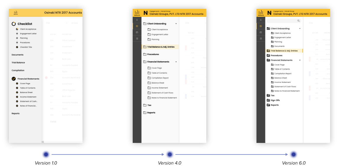
Navigation iteration
Early versions included a progress bar to communicate stage completion, but internal auditor feedback revealed they navigate by initial-letter codes, not visual progress. The progress bar was removed in favor of letters embedded in folder icons, matching the shorthand auditors already used daily. v1.0 through v6.0 each addressed a distinct I&A or visibility challenge.
Iteration on navigation feature
Issues
Notifications
Notes
Right-hand panel
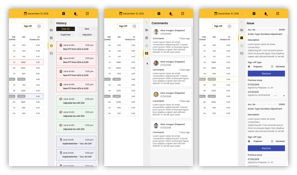
A persistent contextual panel for History, Comments, and Issues; providing Edwin real-time context without ever leaving his current screen.
- Initially embedded in the global header as notifications, team feedback showed auditors needed to reference issues while actively editing data
- Redesigned as an independent side layer integrated across Trial Balance, Procedures, Financial Statements, and Reports
Right-hand panel
Styleguide
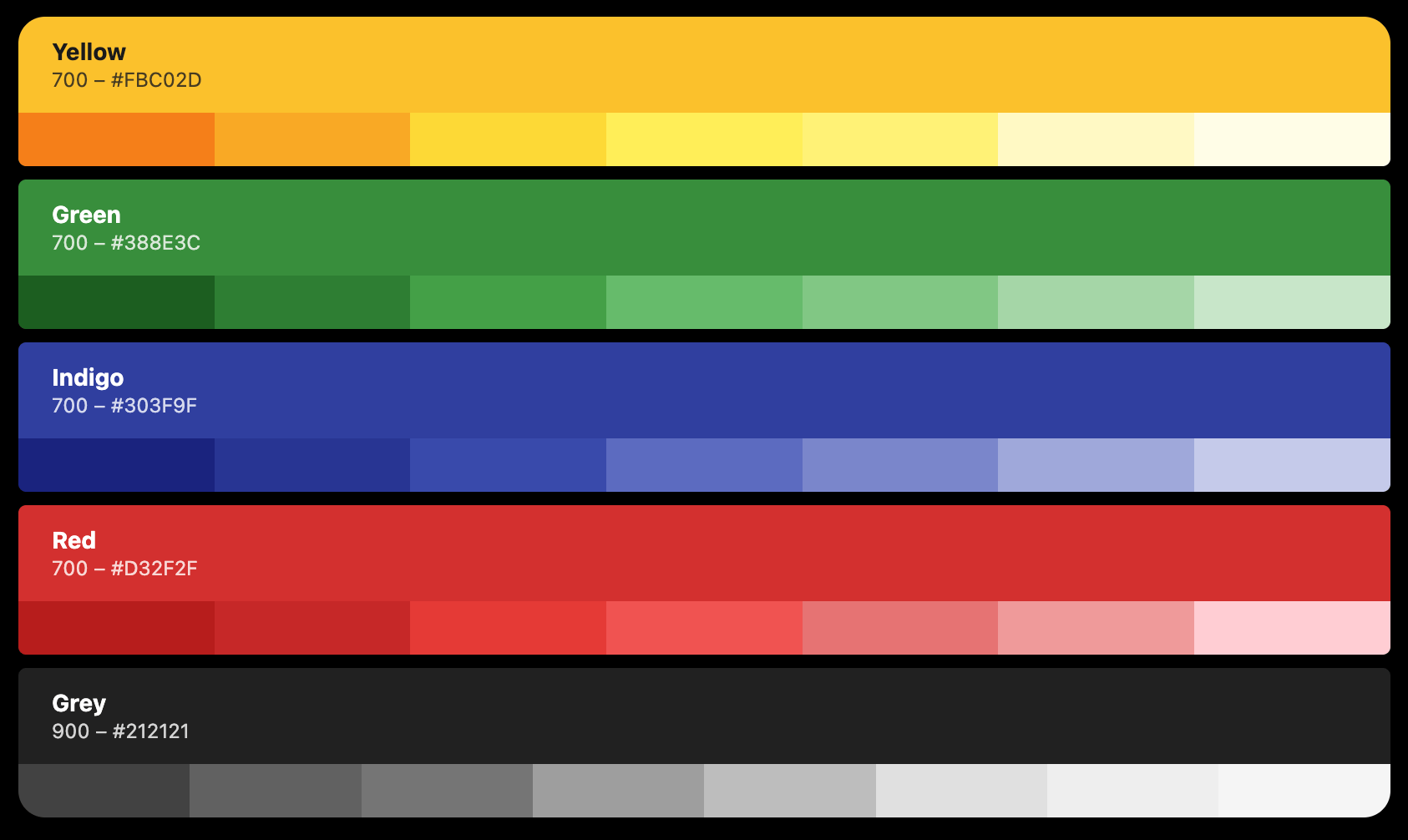
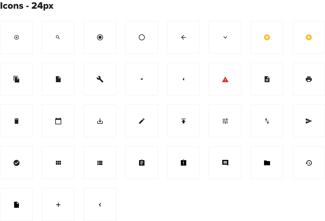
A complete color palette and icon set were defined and delivered, ensuring consistency across all modules and states.
Color palette
Icon - 24px
Deliver
What I delivered
- Defined foundation for a new B2B SaaS platform
- 32 screen prototype and discovery artifacts
- Design specs & documentation for engineer hand off
- Post-MVP product roadmap
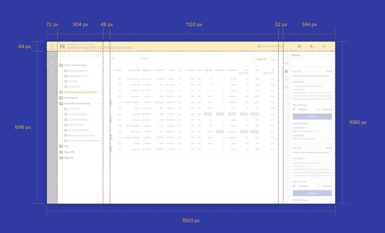
Design specs
Post-MVP product roadmap
Phase 1: Validate & Stabilize | 0 to 3 months post-launch
The MVP established the core workflow. Phase 1 is about proving it works under real conditions.
- Usability testing with 5-8 practicing auditors on core flows: Trial Balance mapping, Procedures categorization, and report generation. Watch for where they hesitate, workaround, or ask questions.
- Session recording and behavioral analytics (Hotjar or similar) to identify drop-off points and rage clicks across all modules
- A/B test the right-hand panel; test whether auditors prefer the panel open by default vs. collapsed, and whether Issues, Comments, or History should be the default active tab
- Error state and empty state audit across all modules; the MVP likely has gaps here that only surface under real engagement conditions
- Establish baseline metrics: time-to-complete per module, sign-off cycle time, number of back-and-forth comment threads per engagement
Phase 2: Deepen Collaboration | 3 to 6 months
The MVP connected the workflow. Phase 2 makes the collaboration layer smarter.
- AI-assisted issue flagging — surface potential errors or missing data in Trial Balance entries before the auditor manually catches them. Pattern-match against common NTR compliance rules.
- In-context chat assistant — a persistent AI assistant that answers audit procedure questions, explains platform functionality, and surfaces relevant engagement history without the auditor leaving their current screen. Trained on NTR standards and the firm's own past engagements.
- Smart engagement templates — pre-populate procedures, engagement letters, and report structures based on client type and prior engagement history, reducing setup time for repeat clients
- Threaded comment resolution tracking — mark comments as resolved, track who resolved them and when, and surface unresolved threads in the global notification system
- A/B test notification delivery: badge counts vs. inline contextual alerts to determine which drives faster issue resolution
Phase 3: Automation | 6 to 12 months
Phase 3 moves from organizing work to accelerating it.
- Automated trial balance reconciliation — flag discrepancies between imported CSV data and mapped accounts automatically, surfacing issues before the auditor reaches the review stage
- Engagement health dashboard — a firm-level view showing all active engagements, outstanding sign-offs, overdue procedures, and team workload distribution across accounts
- Client-facing portal — a simplified interface for clients to upload documents, respond to requests, and track engagement status without needing access to the full auditor workspace
- ML-assisted document review — surface missing documents, flag unsigned engagement letters, and identify procedures not yet completed before the auditor moves to report generation
- Role-based analytics — different dashboards for firm administrators, senior auditors, and junior staff, each surfacing the data most relevant to their responsibilities
- A/B test client portal onboarding: guided step-by-step flow vs. open dashboard to determine which drives faster document submission
Phase 4: Platform Expansion | 12 months and beyond
- Expand beyond NTR to Review and Compilation engagements, applying the same unified workflow model to adjacent audit services
- API integrations with accounting software (QuickBooks, Sage, CaseWare) to automate trial balance imports and eliminate CSV dependency
- Audit trail and compliance reporting for regulatory review, giving firms exportable documentation of every action taken during an engagement
- Mobile companion app for auditors to review, approve, and respond to issues on the go without needing the full desktop platform
- Predictive engagement timelines — use historical engagement data to estimate completion dates, flag at-risk engagements early, and help firms allocate resources proactively


Add-Ons & Benefits
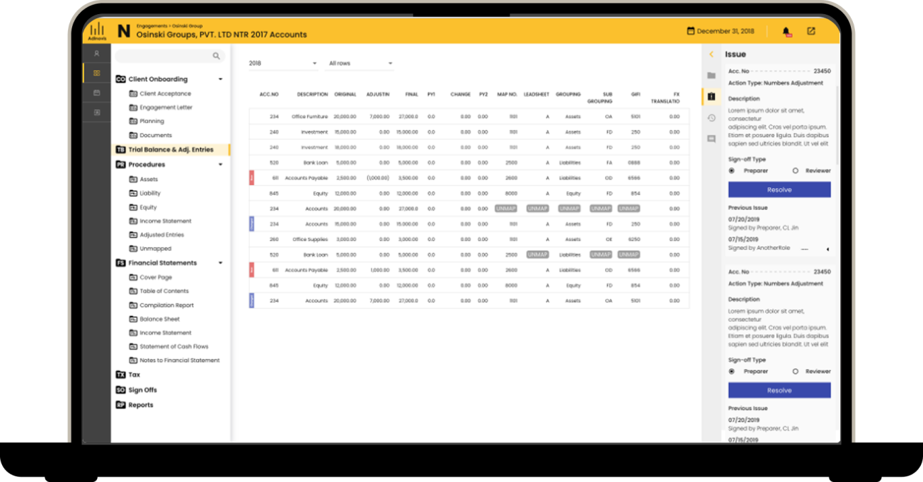
Designed a 0-to-1 SaaS platform that unified 6 disconnected audit phases into a collaborative workspace, reducing a 100+ hour workflow to 10 hours
People Tech Group | UX Designer | Web | B2B, Workflow & Systems
What makes this project unique?
- Enterprise SaaS platform reimagining the entire audit engagement lifecycle into a single collaborative platform
- Connected people, documents, approvals, and audit data in one shared workspace, eliminating fragmented tools and manual handoffs
- Designed for multiple user roles with distinct permissions, workflows, and responsibilities. (clients, accountants, reviewers, administrators)
- Reduced context switching by embedding collaboration tools directly within the workflow instead of relying on email and external document sharing.
My role
- Design strategy & problem alignment
- User roles & workflows definition
- Visual iterations, user testing, & final designs
Problem
Users struggled to understand what add-ons, benefits, data, and subscriptions they even had access to, what was available, and how to manage them.
This initiative brought more add-ons. And an entire classification: Dynamic discounted benefits based on the customer’s rate plan and what they already had.
As requirements evolved, there were so many moving pieces and past one-off quick fixes confusing things, the teams barely knew what was a benefit vs add-on vs subscription. But was tacked onto scope, there was a deeper challenge:
“How might we condense fragmented add-on experiences while creating a system for paid, free, & discounted benefits in a way that is scalable and feels intuitive & cohesive?”
Solution
We redesigned the audit engagement as a single, collaborative workflow instead of a collection of disconnected tasks.
To give auditors a single source of truth and support real-time collaboration, we unified:
- Client onboarding
- Engagement letters
- Trial balance
- Audit procedures
- Financial statements
- Reporting
To collaborate between user roles, we designed reusable interaction patterns for:
- Document review
- Issue tracking
- Comments
- Approvals
Discover
What I did
- Conducted competitive analysis of subscription and add-on experiences
- Ran contextual inquiry to understand user confusion and behaviors
- Facilitated stakeholder conversations across product and marketing
- Used affinity mapping to synthesize findings
Key insights
- Conducted stakeholder workshops with the client and a team of practicing auditors to map the existing NTR engagement process from end to end
- Created the primary persona; representing the Senior Auditor / Super Admin who touched every module and step in Adinovis
Persona
Define
What I did
- Collaborated with product and marketing amid rapidly changing requirements
- Aligned on supporting a new benefits-based initiative tied to plans
- Navigated differing perspectives on separating vs unifying experiences
Current customer journey
Features
Client Onboarding
- Compliance questions
- Document upload
- Reviewer assignment
Engagement Letters
- Digital letter generation
- Sign-off tracking
Trial Balance
- CSV import
- Account mapping
- UNMAP flagging
- Section sign-offs
Procedures
- Account categorization across Assets, Liabilities, Equity, Income, Expense
- Inline reference tracking
Financial Statements
- Structured financial data with collaborative review
Reports
- Final report generation
- Reviewer assignments
- Client delivery archive
Right-hand panel
- Persistent Issues
- Comments
- History panel
Global notification
- Issues
- Notifications
- Notes
Navigation
- Initial-letter coded folder icons matching auditor mental models
Userflow
Key decisions
Unify add-ons and benefits into a single experience
Despite pressure to separate them, I advocated for one destination—aligning with user expectations and reducing complexity.
Client Onboarding
Trial Balance
Procedures
Reports
Design
Approach
With the project already 2 months behind schedule, there was no time for extended design cycles.
The entire initial product direction, covering every major screen across six modules, was established in a single 4 day sprint.
Weekend sessions with developers, auditors, and the client compressed what would typically be weeks of iteration into days, producing 32 wireframes that became the foundation for all subsequent visual design and development.
Rather than traditional usability testing, we embedded practicing auditors directly into the design process as consultants, running structured critiques at each iteration checkpoint.
Their feedback shaped every major decision; from how data was organized within modules to how the navigation reflected the mental models auditors had built over years of practice.
Navigation iteration
Early versions included a progress bar to communicate stage completion, but internal auditor feedback revealed they navigate by initial-letter codes, not visual progress. The progress bar was removed in favor of letters embedded in folder icons, matching the shorthand auditors already used daily. v1.0 through v6.0 each addressed a distinct I&A or visibility challenge.
Iteration on navigation feature
Global notification
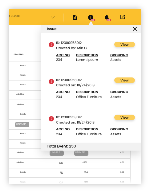
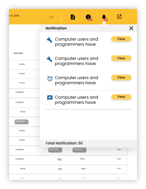
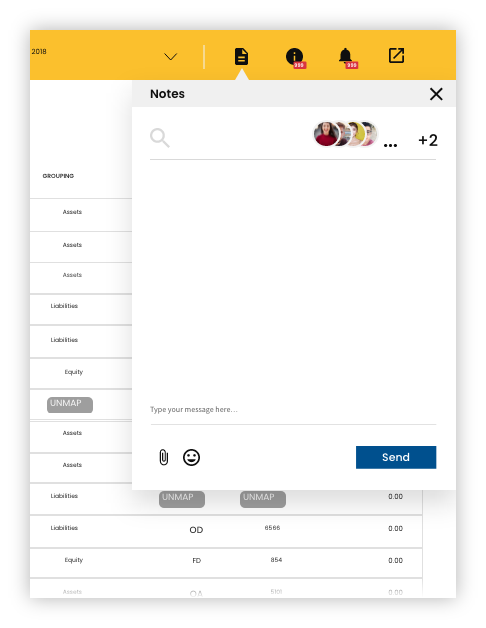
A persistent global header surfaces Issues, Notifications, and Notes across the entire platform. Badge counts on each icon give Edwin real-time awareness of outstanding actions without interrupting his current workflow.
Issues
Notifications
Notes
Right-hand panel
A persistent contextual panel for History, Comments, and Issues; providing Edwin real-time context without ever leaving his current screen.
- Initially embedded in the global header as notifications, team feedback showed auditors needed to reference issues while actively editing data
- Redesigned as an independent side layer integrated across Trial Balance, Procedures, Financial Statements, and Reports
Right-hand panel
Styleguide
A complete color palette and icon set were defined and delivered, ensuring consistency across all modules and states.
Color palette
Icon - 24px
Deliver
What I delivered
- Defined foundation for a new B2B SaaS platform
- 32 screen prototype and discovery artifacts
- Design specs & documentation for engineer hand off
- Post-MVP product roadmap
Design specs
Post-MVP product roadmap
Phase 1: Validate & Stabilize | 0 to 3 months post-launch
The MVP established the core workflow. Phase 1 is about proving it works under real conditions.
- Usability testing with 5-8 practicing auditors on core flows: Trial Balance mapping, Procedures categorization, and report generation. Watch for where they hesitate, workaround, or ask questions.
- Session recording and behavioral analytics (Hotjar or similar) to identify drop-off points and rage clicks across all modules
- A/B test the right-hand panel; test whether auditors prefer the panel open by default vs. collapsed, and whether Issues, Comments, or History should be the default active tab
- Error state and empty state audit across all modules; the MVP likely has gaps here that only surface under real engagement conditions
- Establish baseline metrics: time-to-complete per module, sign-off cycle time, number of back-and-forth comment threads per engagement
Phase 2: Deepen Collaboration | 3 to 6 months
The MVP connected the workflow. Phase 2 makes the collaboration layer smarter.
- AI-assisted issue flagging — surface potential errors or missing data in Trial Balance entries before the auditor manually catches them. Pattern-match against common NTR compliance rules.
- In-context chat assistant — a persistent AI assistant that answers audit procedure questions, explains platform functionality, and surfaces relevant engagement history without the auditor leaving their current screen. Trained on NTR standards and the firm's own past engagements.
- Smart engagement templates — pre-populate procedures, engagement letters, and report structures based on client type and prior engagement history, reducing setup time for repeat clients
- Threaded comment resolution tracking — mark comments as resolved, track who resolved them and when, and surface unresolved threads in the global notification system
- A/B test notification delivery: badge counts vs. inline contextual alerts to determine which drives faster issue resolution
Phase 3: Automation | 6 to 12 months
Phase 3 moves from organizing work to accelerating it.
- Automated trial balance reconciliation — flag discrepancies between imported CSV data and mapped accounts automatically, surfacing issues before the auditor reaches the review stage
- Engagement health dashboard — a firm-level view showing all active engagements, outstanding sign-offs, overdue procedures, and team workload distribution across accounts
- Client-facing portal — a simplified interface for clients to upload documents, respond to requests, and track engagement status without needing access to the full auditor workspace
- ML-assisted document review — surface missing documents, flag unsigned engagement letters, and identify procedures not yet completed before the auditor moves to report generation
- Role-based analytics — different dashboards for firm administrators, senior auditors, and junior staff, each surfacing the data most relevant to their responsibilities
- A/B test client portal onboarding: guided step-by-step flow vs. open dashboard to determine which drives faster document submission
Phase 4: Platform Expansion | 12 months and beyond
- Expand beyond NTR to Review and Compilation engagements, applying the same unified workflow model to adjacent audit services
- API integrations with accounting software (QuickBooks, Sage, CaseWare) to automate trial balance imports and eliminate CSV dependency
- Audit trail and compliance reporting for regulatory review, giving firms exportable documentation of every action taken during an engagement
- Mobile companion app for auditors to review, approve, and respond to issues on the go without needing the full desktop platform
- Predictive engagement timelines — use historical engagement data to estimate completion dates, flag at-risk engagements early, and help firms allocate resources proactively

Add-Ons & Benefits
Designed a 0-to-1 SaaS platform that unified 6 disconnected audit phases into a collaborative workspace, reducing a 100+ hour workflow to 10 hours
People Tech Group | UX Designer | Web | B2B, Workflow & Systems
What makes this project unique?
- Enterprise SaaS platform reimagining the entire audit engagement lifecycle into a single collaborative platform
- Connected people, documents, approvals, and audit data in one shared workspace, eliminating fragmented tools and manual handoffs
- Designed for multiple user roles with distinct permissions, workflows, and responsibilities. (clients, accountants, reviewers, administrators)
- Reduced context switching by embedding collaboration tools directly within the workflow instead of relying on email and external document sharing.
My role
- Design strategy & problem alignment
- User roles & workflows definition
- Visual iterations, user testing, & final designs
Problem
Notice to Reader (NTR) engagements demanded precision, but the workflow depended on disconnected tools.
Accountants managed a single engagement across email, spreadsheets, document repositories, and accounting software with no shared source of truth.
Collaboration, approvals, and document management relied on manual follow-up, making it difficult to maintain visibility, accountability, and version control throughout the engagement.
Solution
We redesigned the audit engagement as a single, collaborative workflow instead of a collection of disconnected tasks.
To give auditors a single source of truth and support real-time collaboration, we unified:
- Client onboarding
- Engagement letters
- Trial balance
- Audit procedures
- Financial statements
- Reporting
To collaborate between user roles, we designed reusable interaction patterns for:
- Document review
- Issue tracking
- Comments
- Approvals
Discover
What I did
- Conducted stakeholder workshops with the client and a team of practicing auditors to map the existing NTR engagement process from end to end
- Created the primary persona; representing the Senior Auditor / Super Admin who touched every module and step in Adinovis
Key insights
- Conducted stakeholder workshops with the client and a team of practicing auditors to map the existing NTR engagement process from end to end
- Created the primary persona; representing the Senior Auditor / Super Admin who touched every module and step in Adinovis
Persona
Define
What I did
Defined the opportunity and scope based on discovery findings
- Current-state customer journey maps documenting every phase of the NTR process, the tools involved at each step, and where fragmentation created the most friction
- Proposed-state journey maps showing how a unified platform could consolidate touchpoints and eliminate manual handoffs
- User flows capturing the full auditor trajectory across the platform, from client acceptance through final report delivery
- Workflow documentation translating complex audit terminology and process logic into structured design requirements the full cross-functional team could act on
Key decisions
- Prioritized unifying all audit phases into one platform rather than improving individual tools
- Scoped the MVP around the NTR engagement specifically — the highest-complexity, highest-volume audit service
- Identified the auditor trajectory as the primary user flow, as it touches the majority of features across the platform
Current customer journey
Features
Client Onboarding
- Compliance questions
- Document upload
- Reviewer assignment
Engagement Letters
- Digital letter generation
- Sign-off tracking
Trial Balance
- CSV import
- Account mapping
- UNMAP flagging
- Section sign-offs
Procedures
- Account categorization across Assets, Liabilities, Equity, Income, Expense
- Inline reference tracking
Financial Statements
- Structured financial data with collaborative review
Reports
- Final report generation
- Reviewer assignments
- Client delivery archive
Right-hand panel
- Persistent Issues
- Comments
- History panel
Global notification
- Issues
- Notifications
- Notes
Navigation
- Initial-letter coded folder icons matching auditor mental models
Userflow
Design
Approach
With the project already 2 months behind schedule, there was no time for extended design cycles.
The entire initial product direction, covering every major screen across six modules, was established in a single 4 day sprint.
Weekend sessions with developers, auditors, and the client compressed what would typically be weeks of iteration into days, producing 32 wireframes that became the foundation for all subsequent visual design and development.
Rather than traditional usability testing, we embedded practicing auditors directly into the design process as consultants, running structured critiques at each iteration checkpoint.
Their feedback shaped every major decision; from how data was organized within modules to how the navigation reflected the mental models auditors had built over years of practice.
Client Onboarding
Trial Balance
Procedures
Reports
Key decisions
Navigation aligned to auditor mental models
- Six iterations revealed that progress-based navigation didn't match how experienced auditors work. Rather than organizing around workflow stages, the final design used initial-letter coded folder icons—mirroring the shorthand auditors already used and reducing the learning curve.
Contextual collaboration through a persistent side panel
- Early designs separated issues and comments from the work itself, forcing auditors to leave their current task to review feedback. A persistent right-hand panel brought issues, comments, and history directly into Trial Balance, Procedures, Financial Statements, and Reports—keeping context visible throughout the workflow.
Global visibility without workflow disruption
- A persistent header surfaced Issues, Notifications, and Notes through badge counts, giving auditors real-time awareness of outstanding actions without interrupting their current work.
Scalable design system for development
- Created a reusable component library and style guide alongside visual designs, providing engineering with consistent patterns and clear specifications for implementation.
Navigation iteration
Early versions included a progress bar to communicate stage completion, but internal auditor feedback revealed they navigate by initial-letter codes, not visual progress. The progress bar was removed in favor of letters embedded in folder icons, matching the shorthand auditors already used daily. v1.0 through v6.0 each addressed a distinct I&A or visibility challenge.
Iteration on navigation feature
Global notification
A persistent global header surfaces Issues, Notifications, and Notes across the entire platform. Badge counts on each icon give Edwin real-time awareness of outstanding actions without interrupting his current workflow.
Issues
Notifications
Notes
Right-hand panel
A persistent contextual panel for History, Comments, and Issues; providing Edwin real-time context without ever leaving his current screen.
- Initially embedded in the global header as notifications, team feedback showed auditors needed to reference issues while actively editing data
- Redesigned as an independent side layer integrated across Trial Balance, Procedures, Financial Statements, and Reports
Right-hand panel
Styleguide
A complete color palette and icon set were defined and delivered, ensuring consistency across all modules and states.
Color palette
Icon - 24px
Deliver
What I delivered
- Defined foundation for a new B2B SaaS platform
- 32 screen prototype and discovery artifacts
- Design specs & documentation for engineer hand off
- Post-MVP product roadmap
Design specs
Post-MVP product roadmap
Phase 1: Validate & Stabilize | 0 to 3 months post-launch
The MVP established the core workflow. Phase 1 is about proving it works under real conditions.
- Usability testing with 5-8 practicing auditors on core flows: Trial Balance mapping, Procedures categorization, and report generation. Watch for where they hesitate, workaround, or ask questions.
- Session recording and behavioral analytics (Hotjar or similar) to identify drop-off points and rage clicks across all modules
- A/B test the right-hand panel; test whether auditors prefer the panel open by default vs. collapsed, and whether Issues, Comments, or History should be the default active tab
- Error state and empty state audit across all modules; the MVP likely has gaps here that only surface under real engagement conditions
- Establish baseline metrics: time-to-complete per module, sign-off cycle time, number of back-and-forth comment threads per engagement
Phase 2: Deepen Collaboration | 3 to 6 months
The MVP connected the workflow. Phase 2 makes the collaboration layer smarter.
- AI-assisted issue flagging — surface potential errors or missing data in Trial Balance entries before the auditor manually catches them. Pattern-match against common NTR compliance rules.
- In-context chat assistant — a persistent AI assistant that answers audit procedure questions, explains platform functionality, and surfaces relevant engagement history without the auditor leaving their current screen. Trained on NTR standards and the firm's own past engagements.
- Smart engagement templates — pre-populate procedures, engagement letters, and report structures based on client type and prior engagement history, reducing setup time for repeat clients
- Threaded comment resolution tracking — mark comments as resolved, track who resolved them and when, and surface unresolved threads in the global notification system
- A/B test notification delivery: badge counts vs. inline contextual alerts to determine which drives faster issue resolution
Phase 3: Automation | 6 to 12 months
Phase 3 moves from organizing work to accelerating it.
- Automated trial balance reconciliation — flag discrepancies between imported CSV data and mapped accounts automatically, surfacing issues before the auditor reaches the review stage
- Engagement health dashboard — a firm-level view showing all active engagements, outstanding sign-offs, overdue procedures, and team workload distribution across accounts
- Client-facing portal — a simplified interface for clients to upload documents, respond to requests, and track engagement status without needing access to the full auditor workspace
- ML-assisted document review — surface missing documents, flag unsigned engagement letters, and identify procedures not yet completed before the auditor moves to report generation
- Role-based analytics — different dashboards for firm administrators, senior auditors, and junior staff, each surfacing the data most relevant to their responsibilities
- A/B test client portal onboarding: guided step-by-step flow vs. open dashboard to determine which drives faster document submission
Phase 4: Platform Expansion | 12 months and beyond
- Expand beyond NTR to Review and Compilation engagements, applying the same unified workflow model to adjacent audit services
- API integrations with accounting software (QuickBooks, Sage, CaseWare) to automate trial balance imports and eliminate CSV dependency
- Audit trail and compliance reporting for regulatory review, giving firms exportable documentation of every action taken during an engagement
- Mobile companion app for auditors to review, approve, and respond to issues on the go without needing the full desktop platform
- Predictive engagement timelines — use historical engagement data to estimate completion dates, flag at-risk engagements early, and help firms allocate resources proactively